Meraaki Kitchen

SCOPE OF PROJECT: Logo Design Print Design Logo Design A mix of various cuisines, Meraaki offers an interesting variety of dishes to its patrons. Taking this USP ahead, we created a logo which was a ‘mix’ of sorts visually – serif and sans serif font, upper and lower case alphabets and a unique color scheme […]
SMIFS
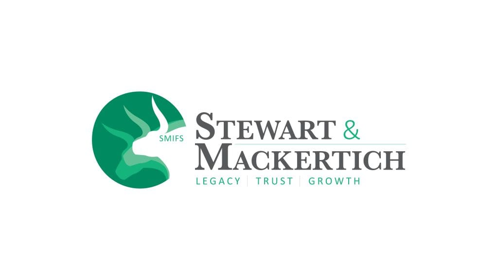
SCOPE OF PROJECT: Logo Design Logo Design The logo retains the legacy of the firm but also shows that a new generation is now taking over. A three-headed bull combined with a serif font represent fast growth and movement. Green, the color of money, is the natural palette choice here.
Kia
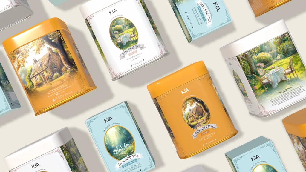
2016 2025 SCOPE OF PROJECT: Packaging Design Packaging Design Design that is a combination of tradition and modernity, we created a pattern that is an extension of the brand’s logo – inspired by designs of the Middle East. 2025 SCOPE OF PROJECT: Packaging Design Packaging Design – Early Grey Tea The process of making tea […]
Tea Lover’s Treasury
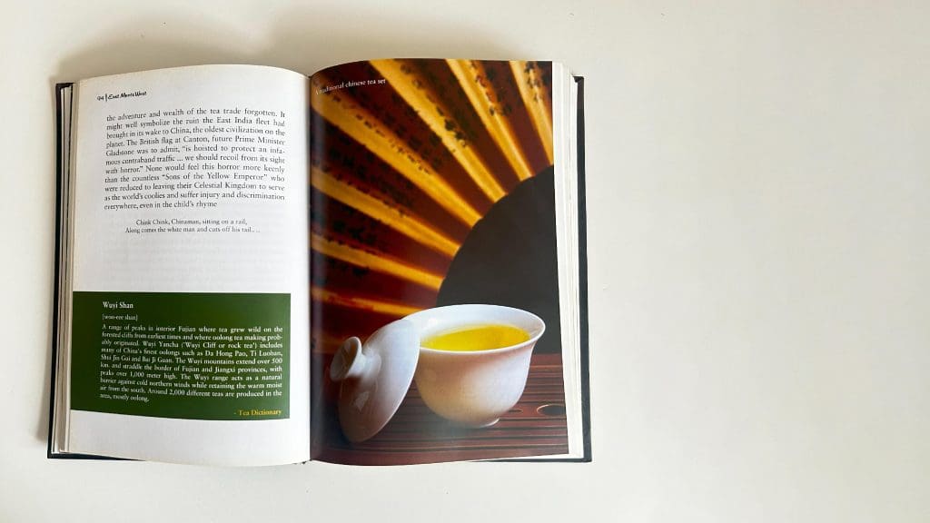
SCOPE OF PROJECT: Editorial Design Editorial Design A 300+ page book that consists primarily of textual information and facts on tea, tracing its long and beautiful journey. The text is occasionally given a break using unique visuals and the introduction of a fresh colour, marking the beginning of a new section. Cover Design: Jennifer […]
Young Minds Collective

SCOPE OF PROJECT: Website Design Website Design https://designpinata.com/wp-content/uploads/2024/10/Carousel-1.mp4 Our website design process began with identifying the purpose of the website – to provide easy access to information. Considering that the end users of the service are not children but the intermediaries who will access the website are parents, we aimed to strike a balance between […]
Spectra Fashions
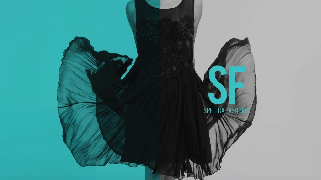
SCOPE OF PROJECT: Editorial Design Print Design Editorial Design https://designpinata.com/wp-content/uploads/2026/03/SpectraFashion_PrintDesign.mp4 The sea blue colour from the logo was carried forward while designing the brand brochure. Textile patterns have been used as backgrounds, and shades of black, white and grey have been used to balance the usage of sea blue.
Kolony Tea
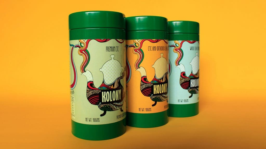
SCOPE OF PROJECT: Packaging Design Packaging Design For Kolony Tea we used a bright and dynamic style, illustrated by hand, influenced by India. The packaging design is bold, unique, unpredictable.
Marici Experience Centre
SCOPE OF PROJECT: Logo Design Print Design Logo Design The brand is inherently contemporary and minimal in nature. Hence, their visual identity lives up to the same design ethos, without diluting the central theme of ‘light’ in its approach. Print Design The stationery is an extension of the visual identity of the brand.
