Our website design process began with identifying the purpose of the website – to provide easy access to information. Considering that the end users of the service are not children but the intermediaries who will access the website are parents, we aimed to strike a balance between simplicity and persuasion without being excessively elaborate.
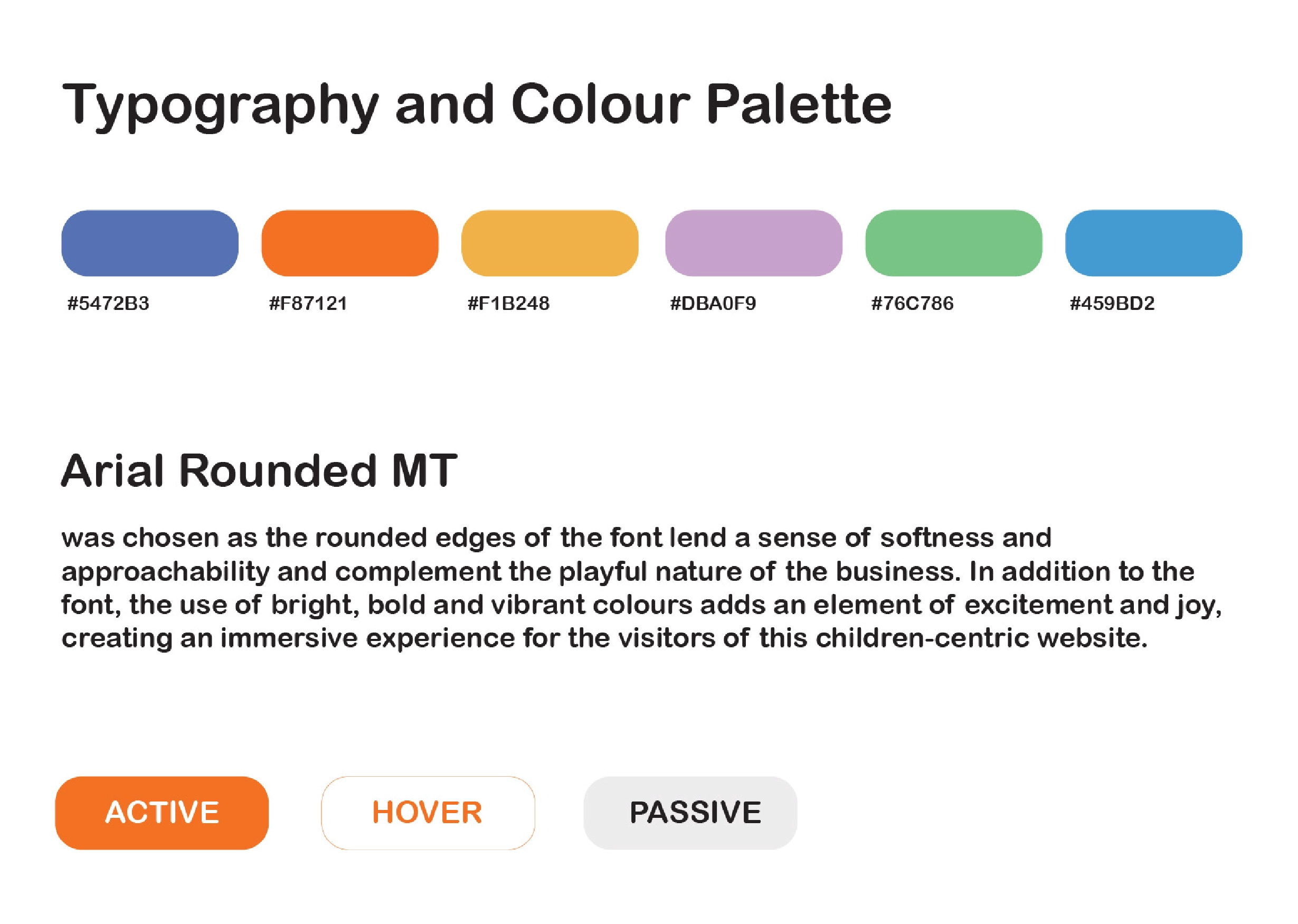
To achieve a child-friendly yet approachable aesthetic, we chose Arial Rounded MT as the font, which has rounded edges that convey softness. Bright, bold, and vibrant colours were used to create an exciting and joyful experience for visitors to the website.
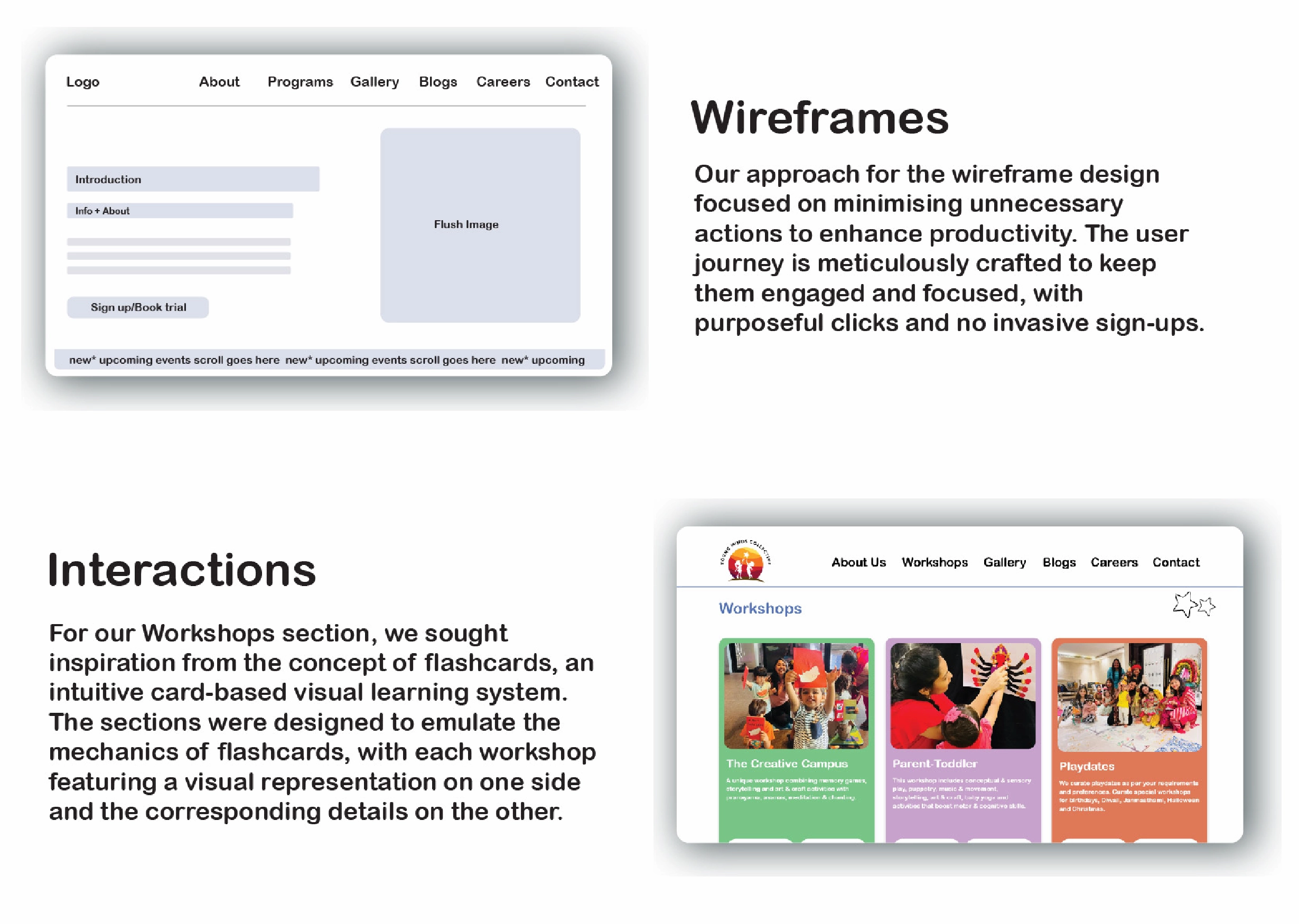
Maintaining a distinction between ‘child-friendly’ and ‘childish’ was crucial, and we kept this in mind throughout our design process. Understanding that time-pressed parents are a key target audience, our wireframe design focused on easy navigation and quick access to information, minimising unnecessary actions and avoiding intrusive sign-ups.
Inspired by the concept of flashcards, a familiar visual learning system for children and parents alike, we designed the Workshop section in a card-based format for intuitive browsing.
The idea behind the consultancy was to offer 360 degree solutions that ensure brand growth and recall, while standing out from competitors. We transformed the brand’s visual language into a complete brand identity — starting with both logos and making them adaptable across mediums. To maintain consistency, the same family of fonts was assigned to both brands. Simple and easy visual elements brought in warmth and ease of engagement. Analysis of their existing strategy, competitor study and a parent survey informed each decision of the consultancy process. We focused on strengthening strategic communication for the brand through training sessions on social media, marketing, and content creation. This was consolidated into comprehensive social media manuals for future reference. Finally, the teams were trained in terms of strategy building and applying the newly developed brand identity to finished artworks.
Our website design process began with identifying the purpose of the website – to provide easy access to information. Considering that the end users of the service are not children but the intermediaries who will access the website are parents, we aimed to strike a balance between simplicity and persuasion without being excessively elaborate.
To achieve a child-friendly yet approachable aesthetic, we chose Arial Rounded MT as the font, which has rounded edges that convey softness. Bright, bold, and vibrant colours were used to create an exciting and joyful experience for visitors to the website.
Maintaining a distinction between ‘child-friendly’ and ‘childish’ was crucial, and we kept this in mind throughout our design process. Understanding that time-pressed parents are a key target audience, our wireframe design focused on easy navigation and quick access to information, minimising unnecessary actions and avoiding intrusive sign-ups. Inspired by the concept of flashcards, a familiar visual learning system for children and parents alike, we designed the Workshop section in a card-based format for intuitive browsing.