MSP
SCOPE OF PROJECT: Logo Design Print Design Logo Design A fresh look at a brand that has been around for 2 decades, the MSP directors had a clear vision for their logo. It must convey growth, strength, endurance. One of the most popular & iconic symbols of growth is an upward facing arrow. The logo […]
Frontier Warehousing
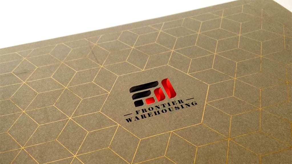
SCOPE OF PROJECT: Logo Design Print Design Website Design Logo Design High recall and uniqueness lie at the crux of this brief, along with staying relevant for decades down the line. Corporate and chic, the logo for Frontier Warehousing ticks all the client’s boxes. Print Design Extending the brand elements forward, the curved edge was […]
Graze
SCOPE OF PROJECT: Logo Design Packaging Design Logo Design https://designpinata.com/wp-content/uploads/2026/03/GRAZE_LOGO.mp4 Graze is all about curating made to taste hampers. Their logo needs to do justice to their approach. Hence, a regular font just wouldn’t do. Instead, we chose to hand letter a font for their branding to make their logo as personal as their brand […]
Gems Akademia International School
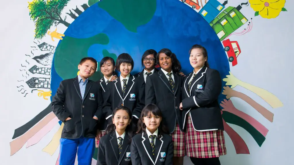
SCOPE OF PROJECT: Brand Identity Naming + Tagline Logo Design Print Design Art Direction Advertisements Brand Identity, Naming + Tagline, Logo Design The logo depicts a merger of a vividly coloured book of knowledge and a prism. It exemplifies the schools vision and belief that each child is unique and deserves a supportive environment where […]
TCL Co.

SCOPE OF PROJECT: Logo Design Art Direction Social Media Logo Design The brand has been around for over 250 years and continues to be relevant in today’s world. Luxury tableware that is a result of skilled craftsmanship, modern techniques but conventional methods (carrying secrets that have been passed over generations) is what defines the brand. […]
JC Group

SCOPE OF PROJECT: Logo Design Print Design Website Design Logo Design A logo is the most effective representation of a brand’s identity. An origami bird with the focal point being its wings was chosen as a symbol for this ever growing and expanding company. Print Design An extension of the logo and brand colours was […]
Aajisai
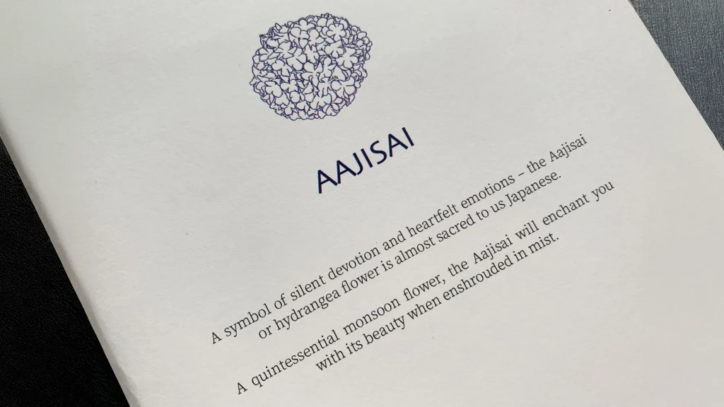
SCOPE OF PROJECT: Print Design Print Design https://designpinata.com/wp-content/uploads/2026/03/Aajisai_PrintDesign_2.mp4 An authentic Japanese restaurant calls for a minimal approach. The complex dishes were presented in a clear layout and the text in metal prototype on a leather folder added an element of luxury to the minimal design. Leather was also the preferred medium for menus cover over […]
Shadowfax

SCOPE OF PROJECT: Logo Design Print Design Logo Design The logo for Shadowfax is inspired by Gandalf’s ‘Lord of All Horses’ and cleverly combines it with the shape of The Knight, one of the oldest chess pieces that has existed since around the 6th century. Print Design The logo and brand colors extended to the […]
Shaktigarh
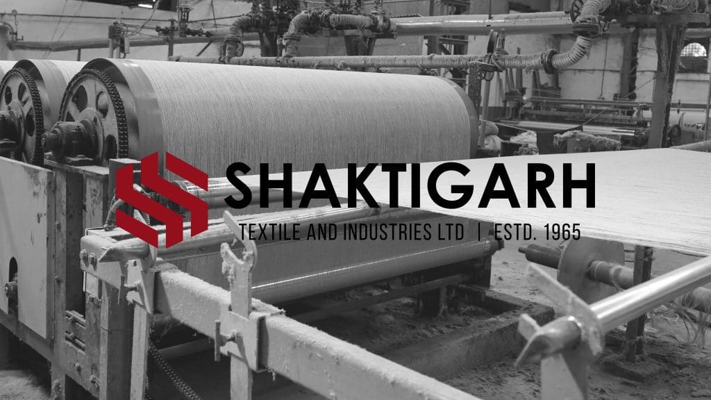
SCOPE OF PROJECT: Logo Design Print Design Website Design Logo Design Rebranding an evolving identity – a geometrical ‘S’ sits at the helm of this logo. Decades of heritage are woven with innovation and a futuristic approach. Print Design Website Design https://designpinata.com/wp-content/uploads/2024/11/Shaktigarh_Website.mp4 www.shaktigarh.com
The Burlap People
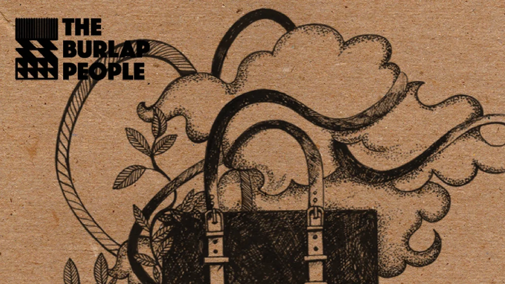
SCOPE OF PROJECT: Print Design Print design Earthy designs for earthy souls, a hand-illustrated bag intertwined with the branches of a jute plant seemed to be the apt route for the tags designed for them.
