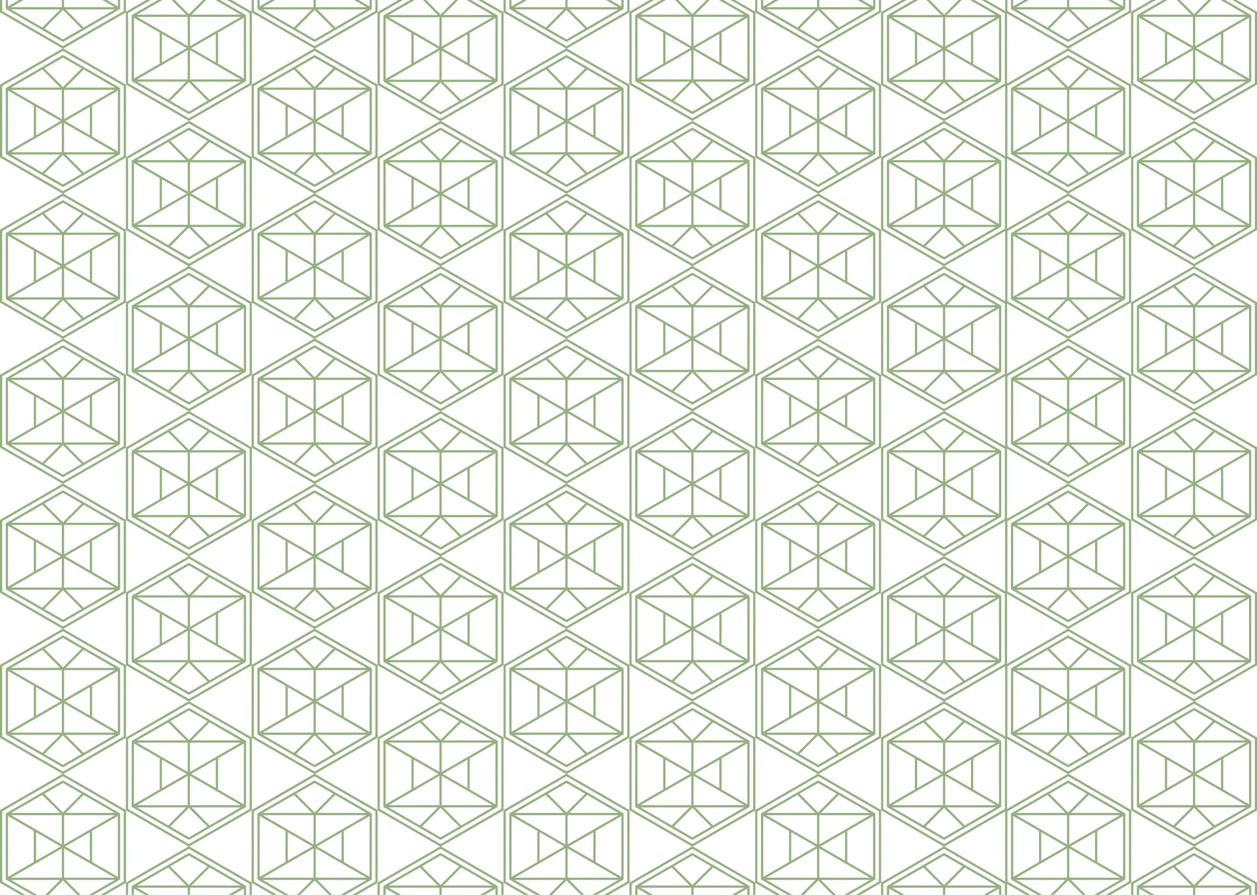
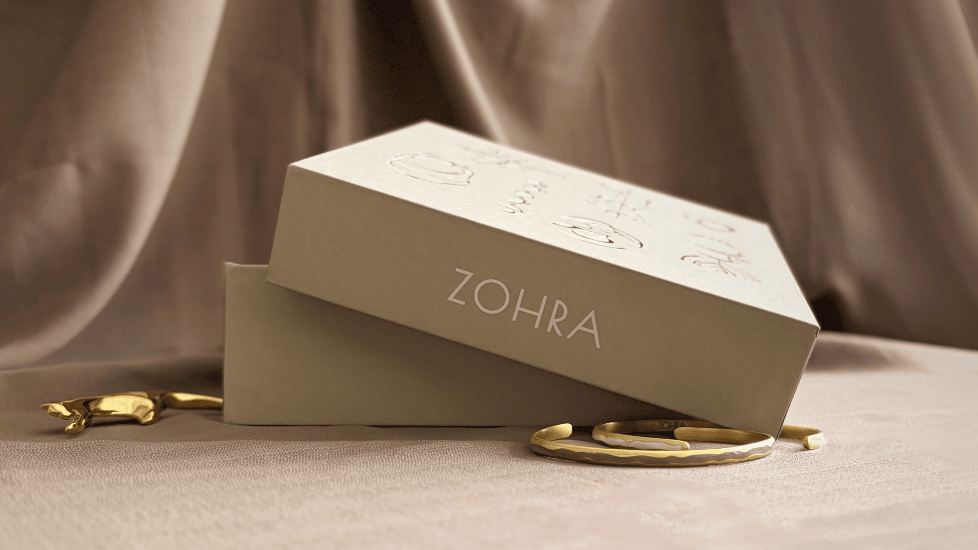
Handcrafted jewellery calls for gift boxes that are just as ornate and detailed. Silhouettes of the brand’s designs are used on the box lid, embellished with gold foiling. This is accompanied by print collaterals – a gift card and a care card, that echo their culture of knowledge. The text across the box is a reflection of the brand’s ethos, a curated approach to creating lasting jewellery that’s an extension of the wearer. A shopping bag is designed in tandem with the packaging, with the brand mnemonic used as a pattern on the sides.