Wear Equal

Wear Equal is a sustainable and inclusive intimate apparel brand that creates premium, upcycled loungewear, underwear, bralettes, and accessories for all bodies and identities.

SCOPE OF PROJECT:

Brand Identity

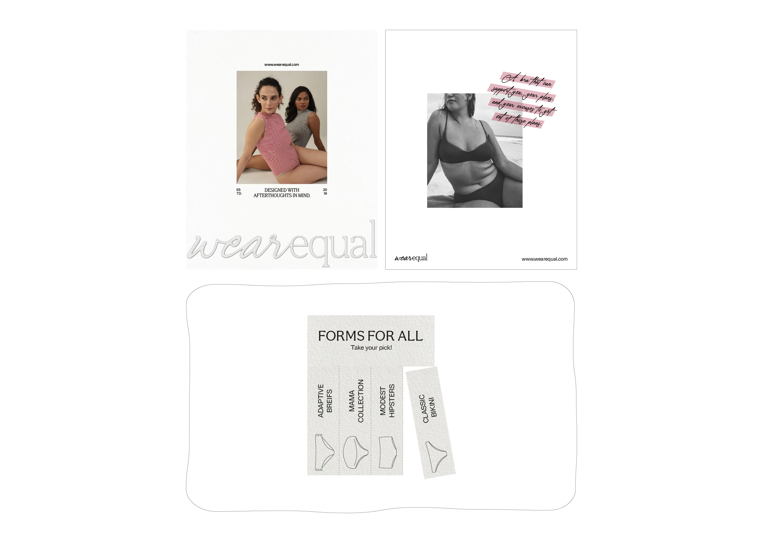
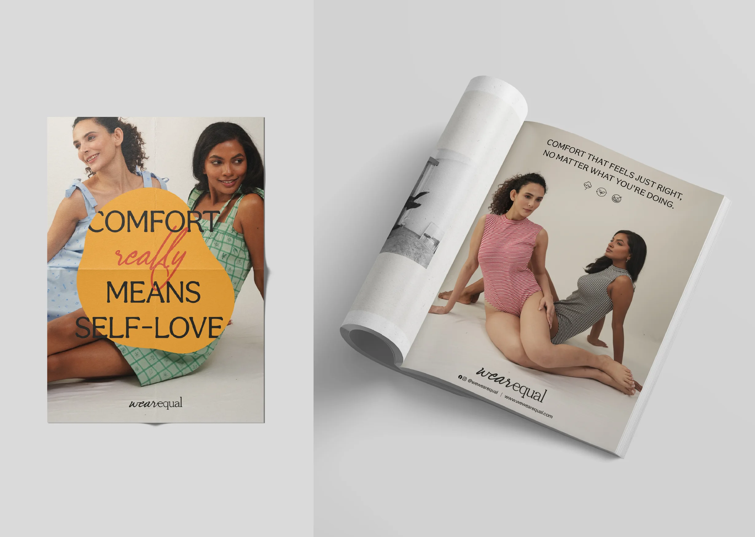
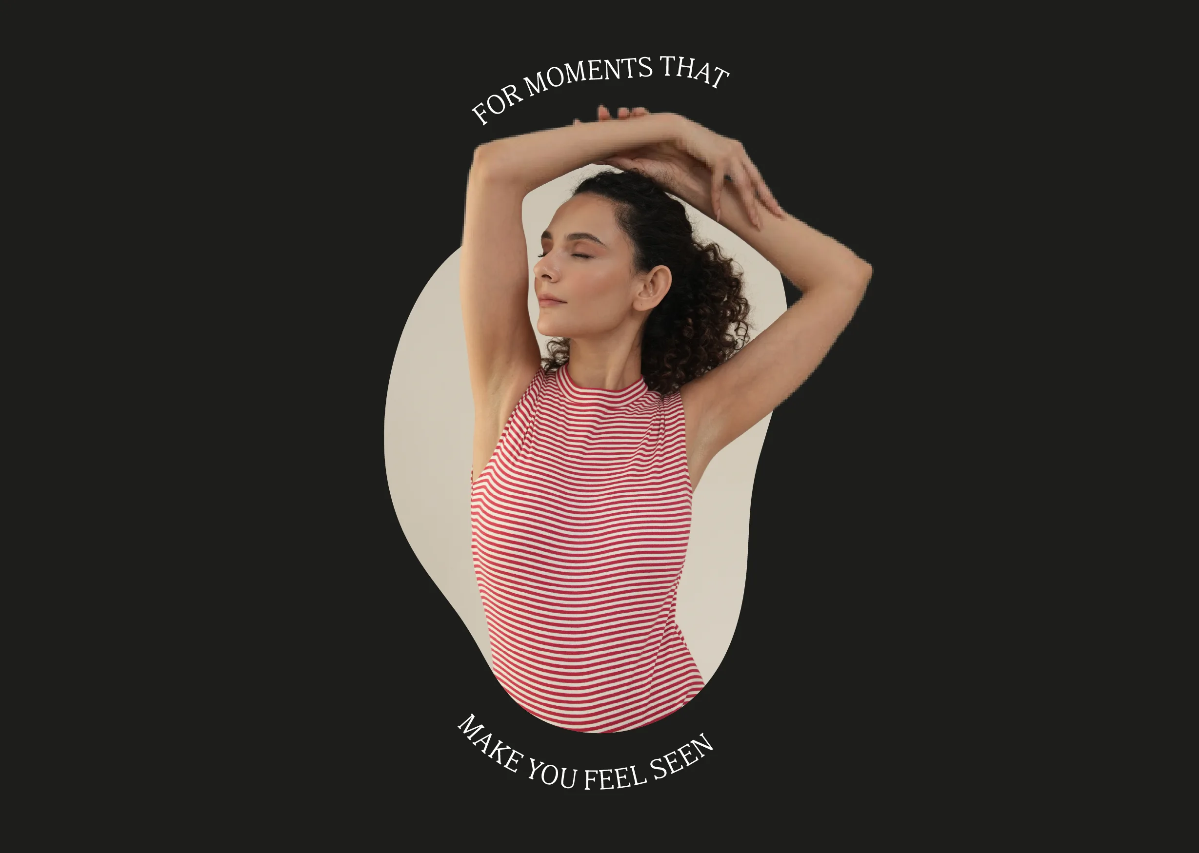
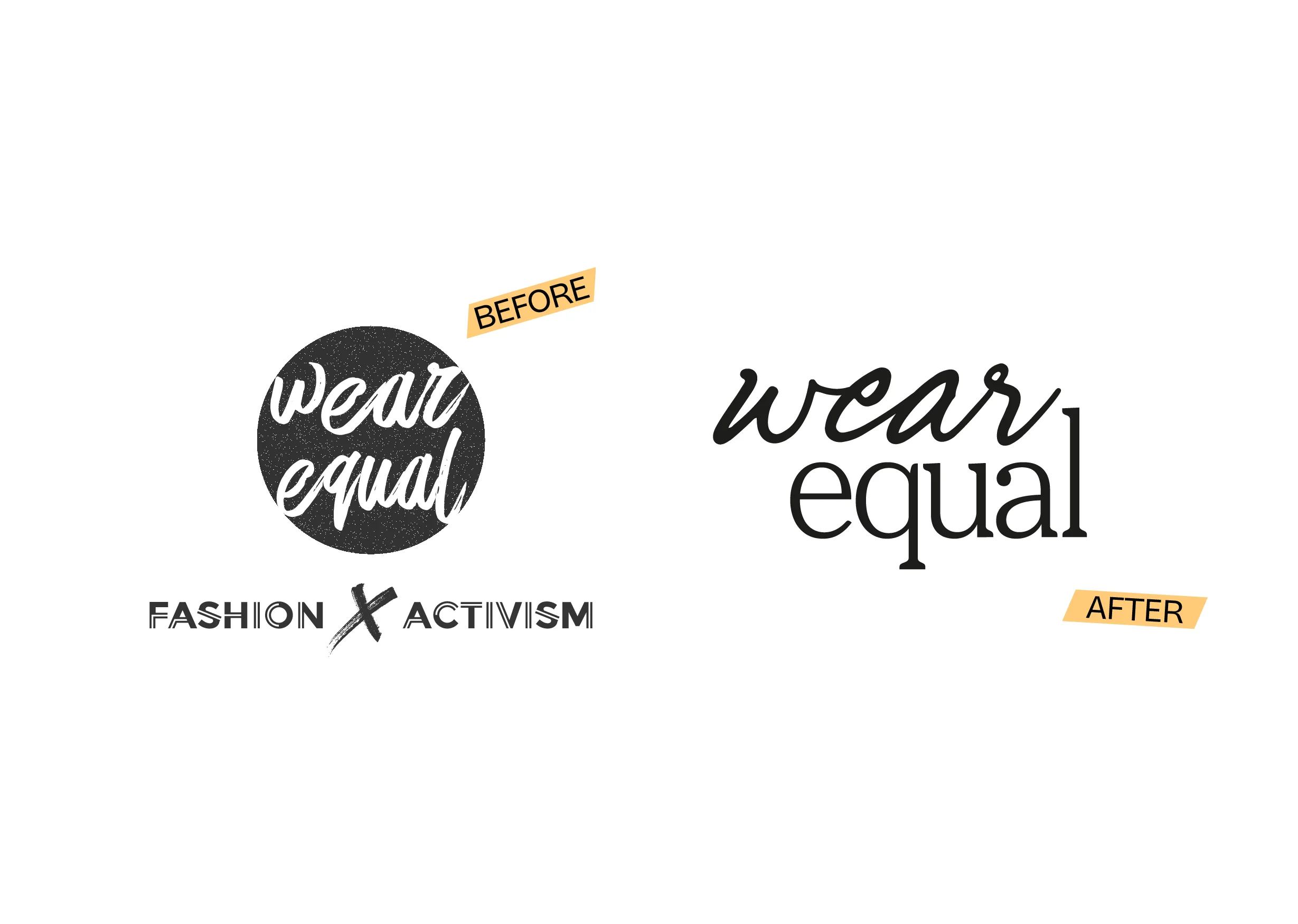
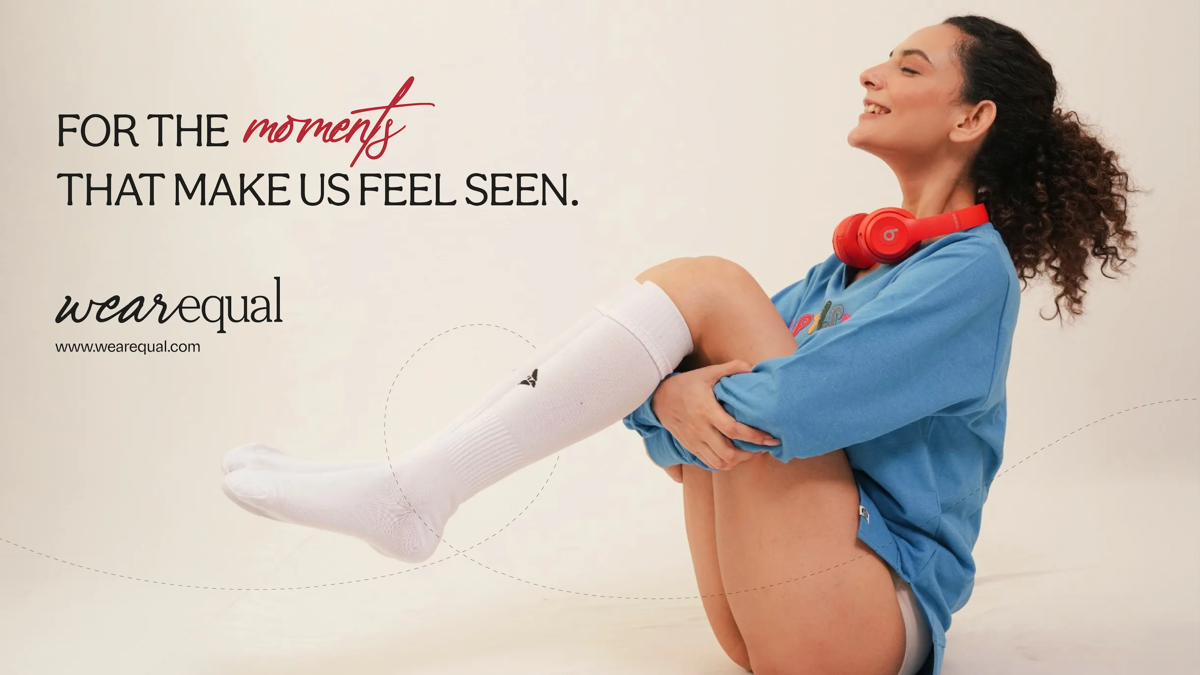
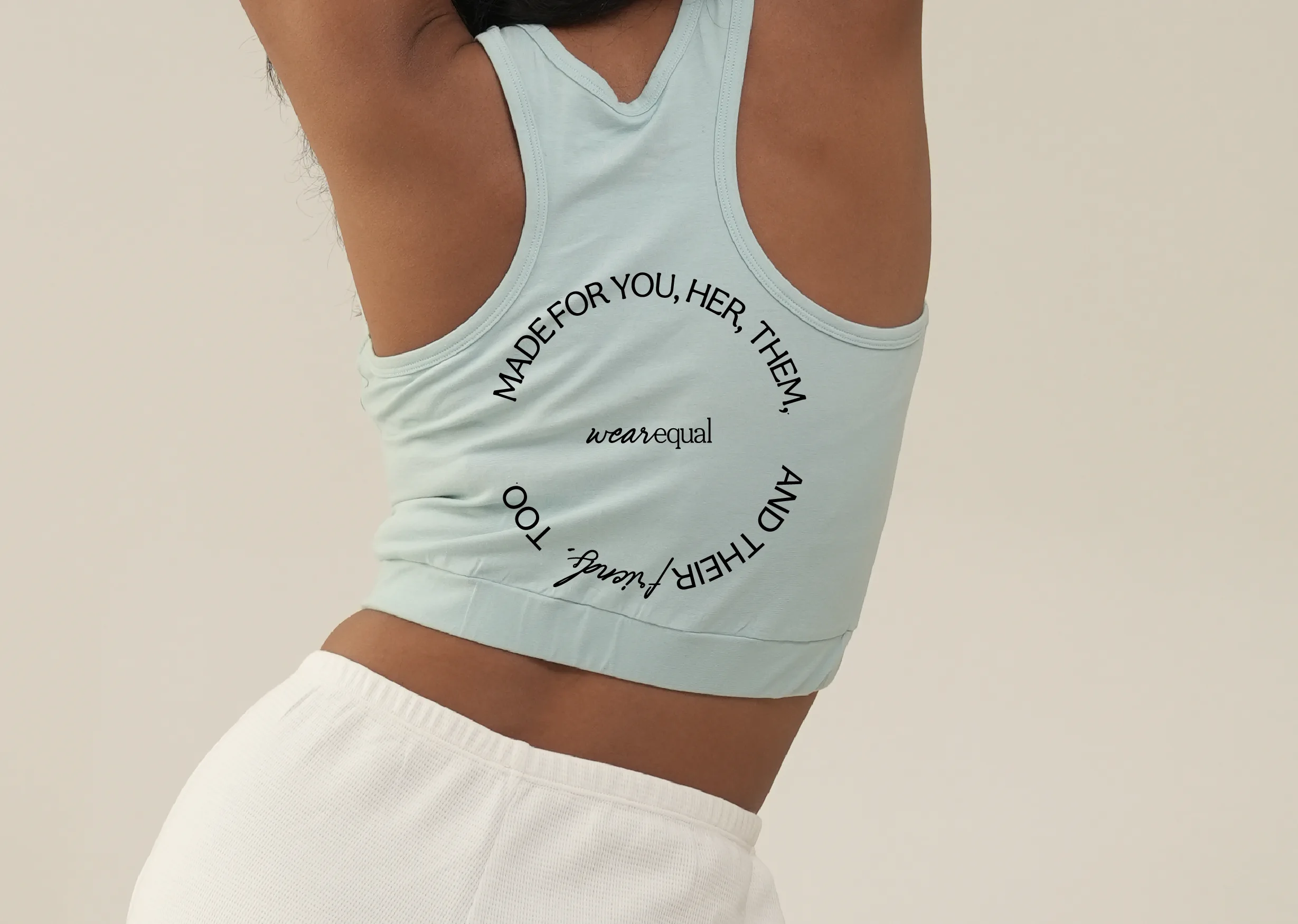
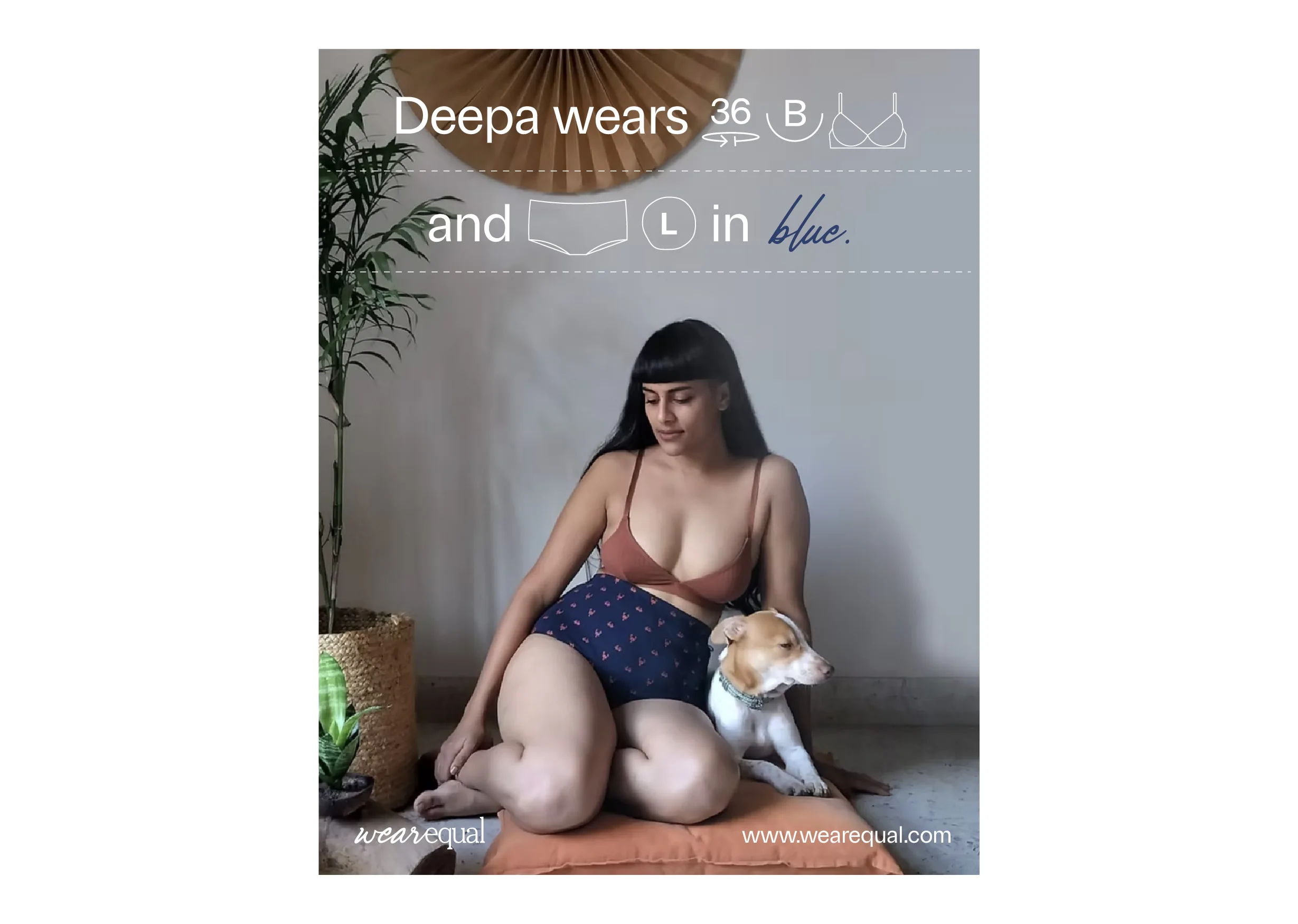
Rebranding Wear Equal meant analysing the existing brand and identifying whether change is necessary. After conducting market research, certain conclusions were reached on what the brand stood for and what it needed to be for its audience. Wear Equal began with a simple but powerful belief: comfort should never come with conditions. But as the brand evolved, there was an opportunity to sharpen what that truly meant: emotionally, culturally, and structurally. The visual representation reflected these virtues. A rich yet restrained colour palette introduced emotional depth while remaining approachable and lived-in.

Logo Design

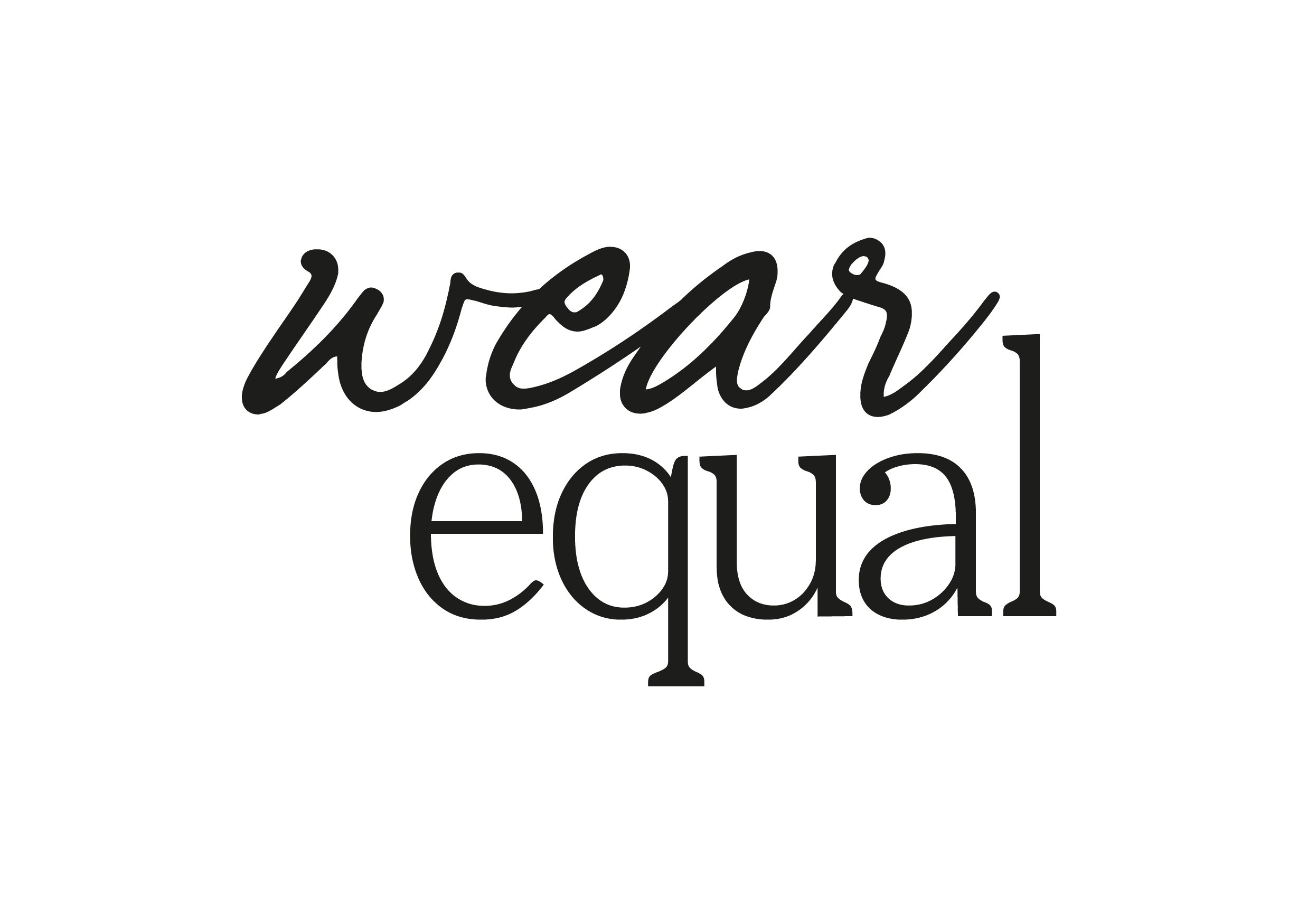
Since the rebrand focused on ensuring Wear Equal presents a more grounded and human expression of comfort, the logo was designed to reflect a softer, more integrated form of resistance, prioritising ease, community, and adaptability. It represented a balance of confidence, playfulness, and belonging.
"*" indicates required fields

This field is for validation purposes and should be left unchanged.
Accepted file types: pdf, Max. file size: 5 MB.
Upload Portfolio/CV