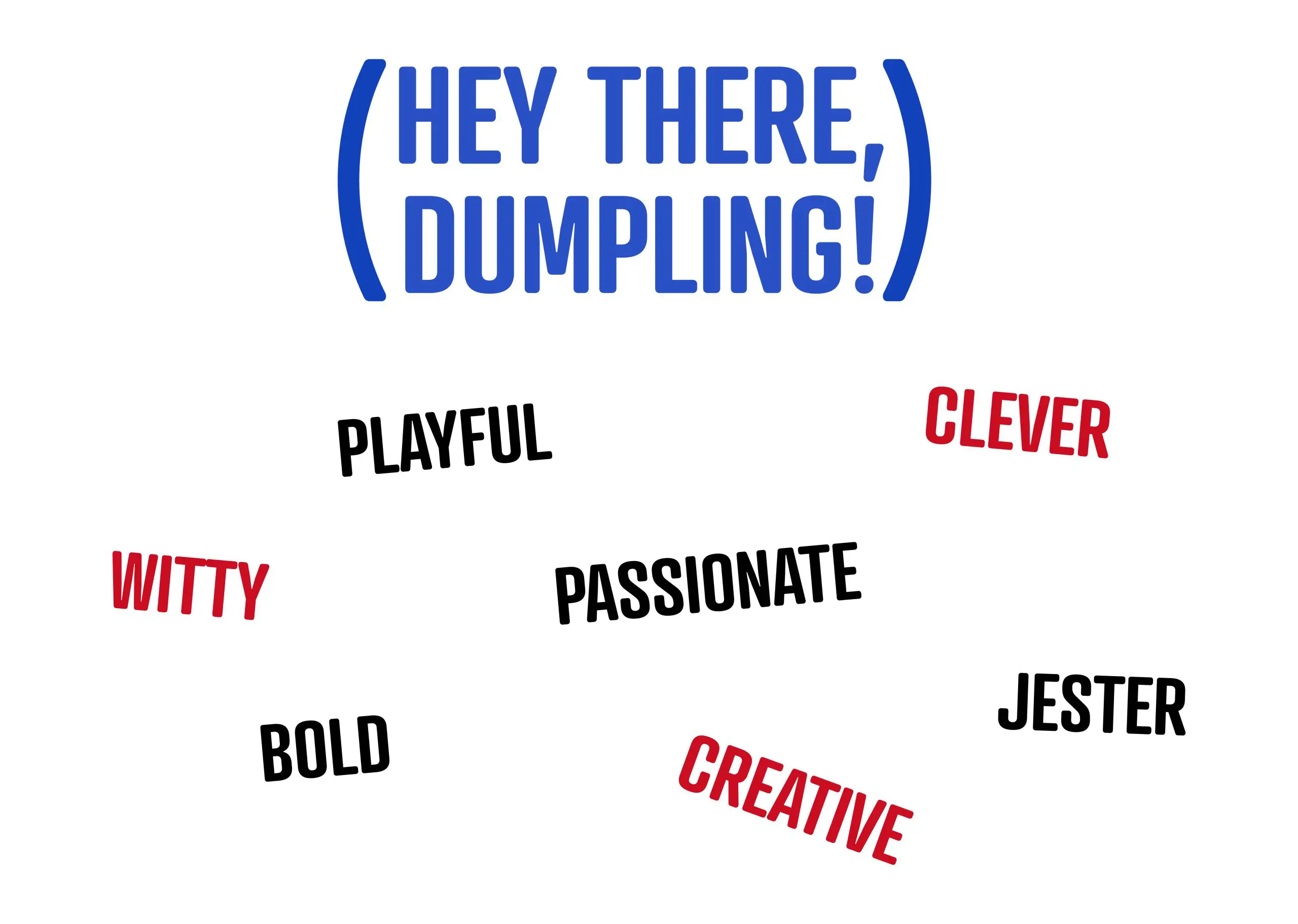
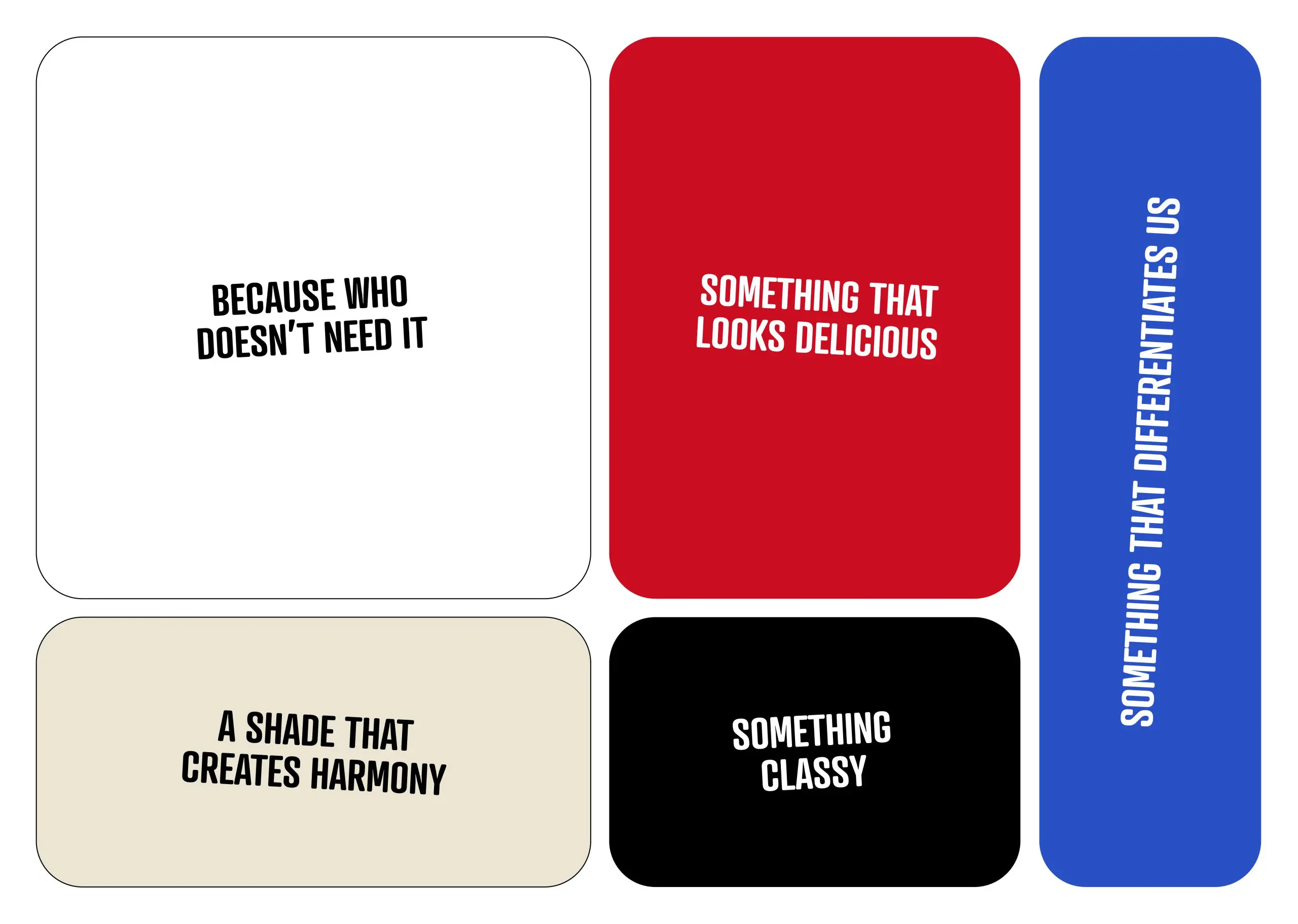
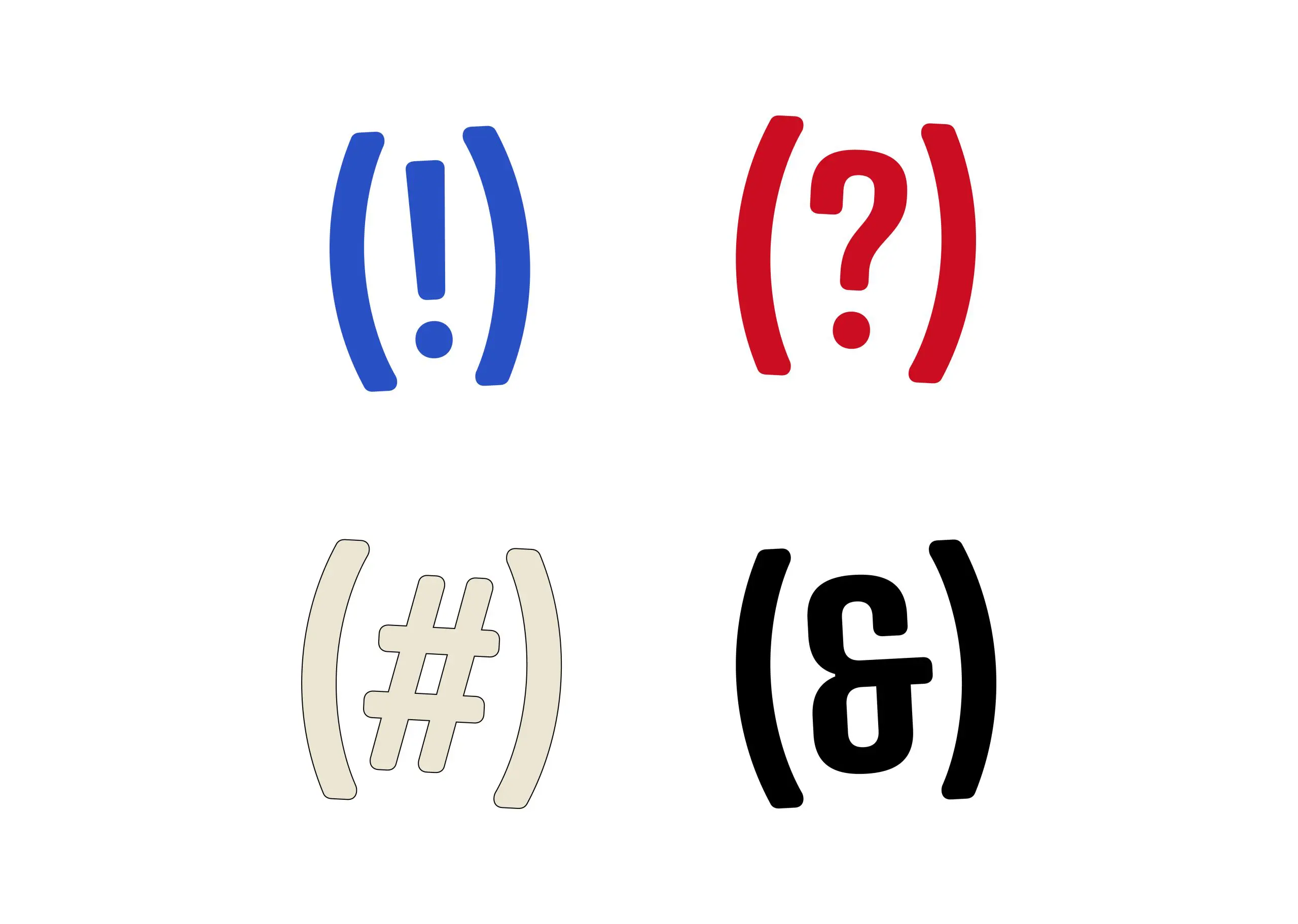
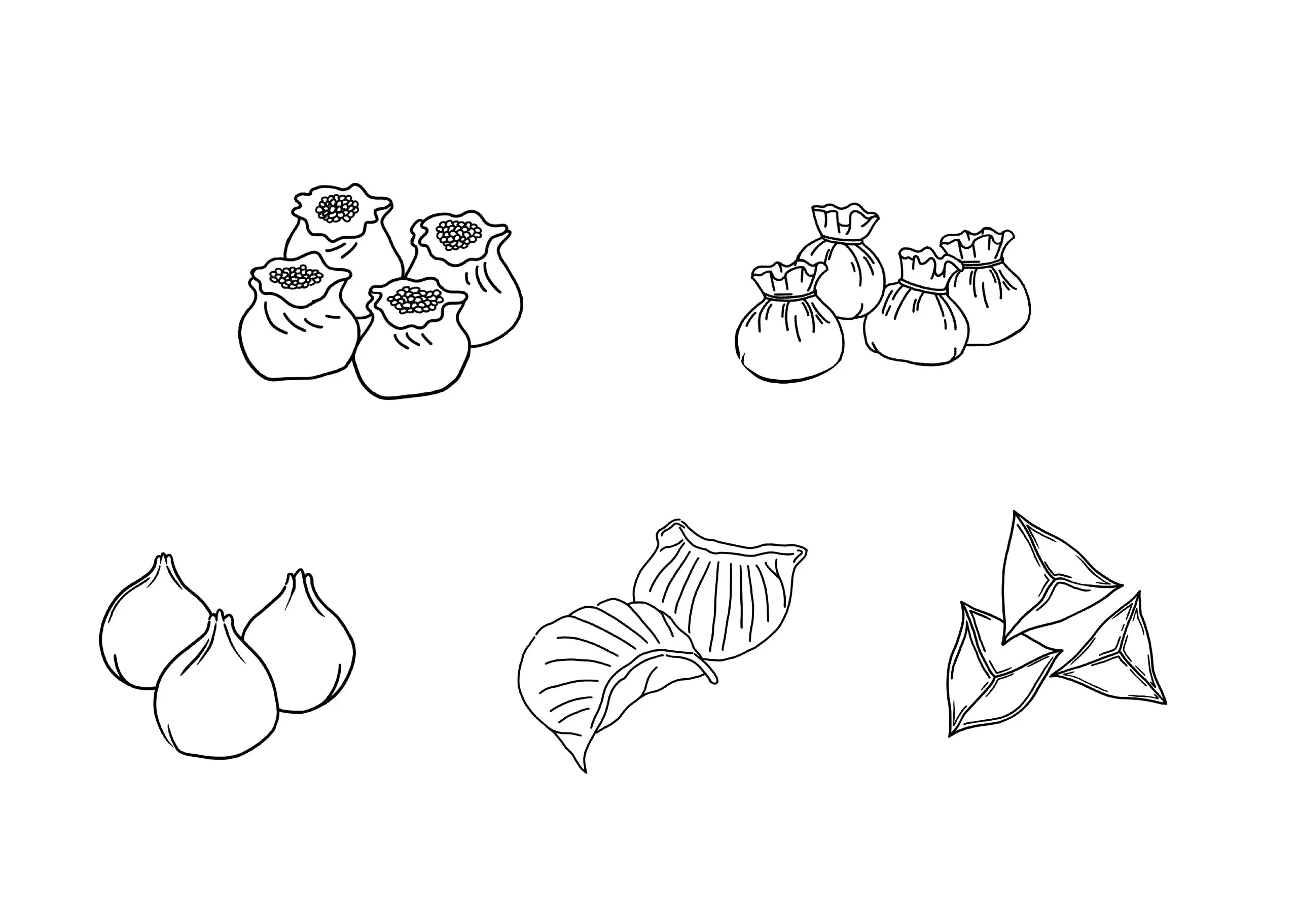
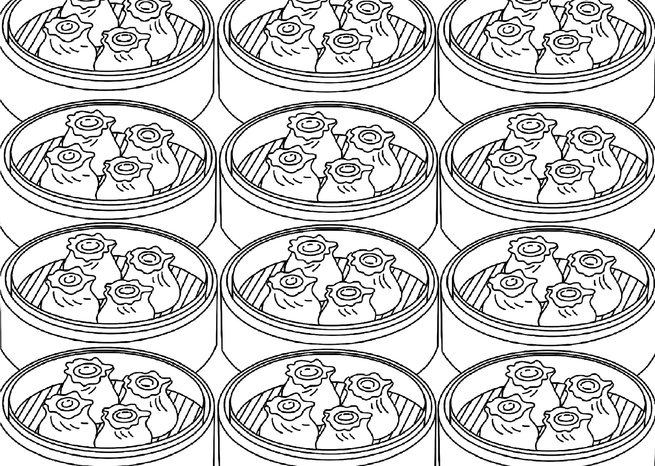
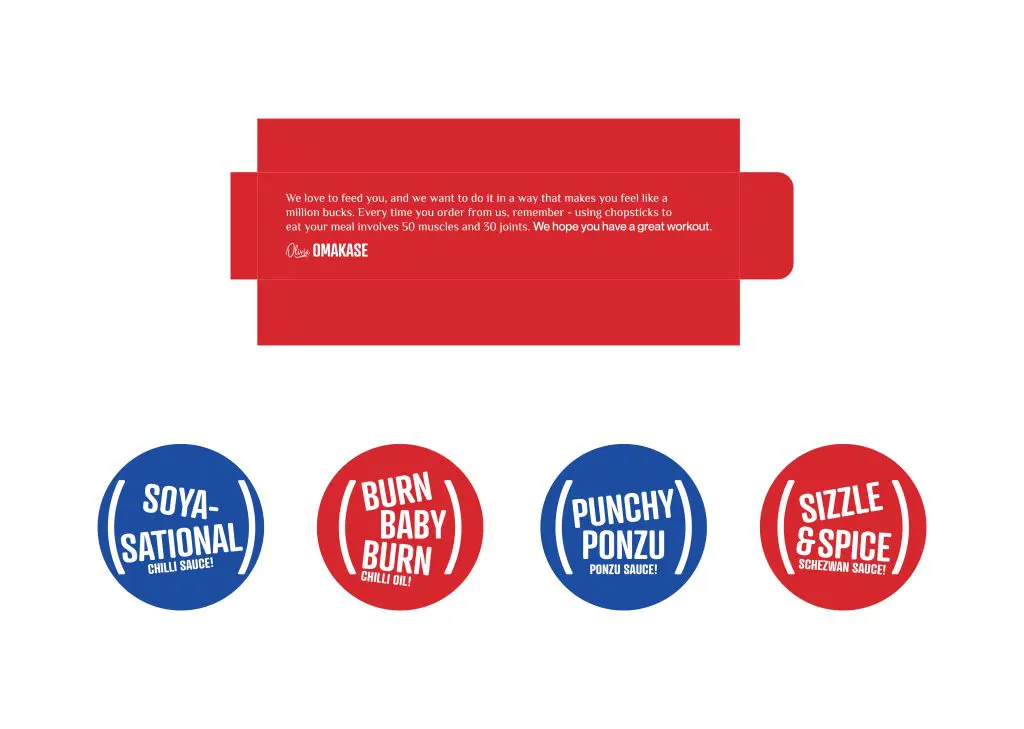
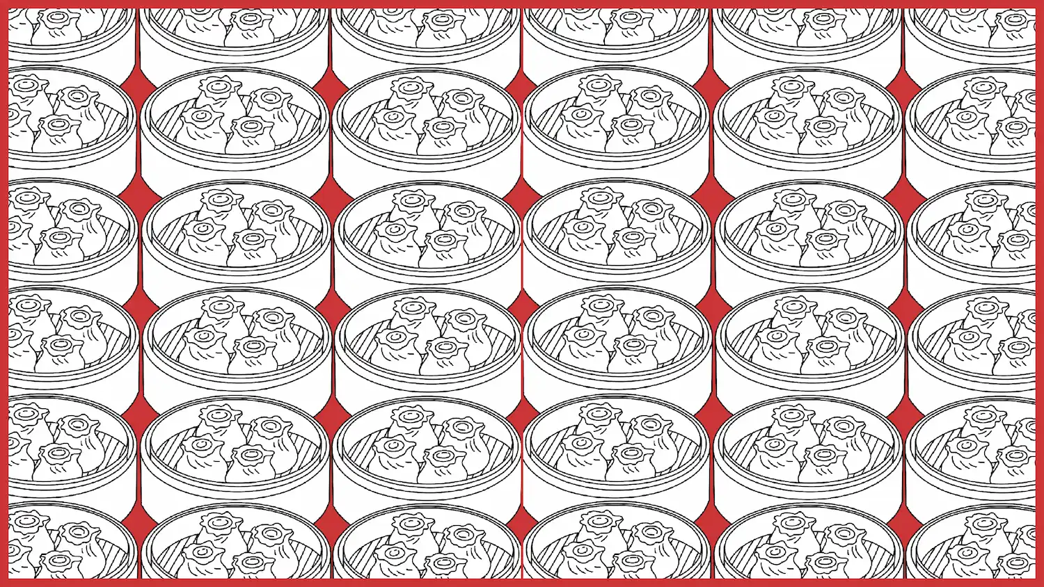
Borrowing from its sister concern brand, Olivia Creamery, the brand name takes after an old Asian adage, ‘Omakase’ which translates to “I’ll leave it up to you.” It alludes to the personal touch added when you steam the dumplings yourself. The brand’s identity mirrors its unique concept, built around the Jester archetype — clever, witty and playful. The brand’s colour hierarchy comprises five distinct colours: Blue, Red, Black, Beige and White, used with intention to create contrast and visual rhythm. Although the brand has four fonts including a system font, the typography is simple and easily legible, ensuring that the brand remains approachable. A simple line illustration style is used where brand colours are applied sparingly. Distinctive graphic elements — brackets, punctuation marks, tilted text, Chinese characters, round-edged boxes, playful circular text wraps and patterns contribute to the brand’s witty and dynamic personality.
Logo Design
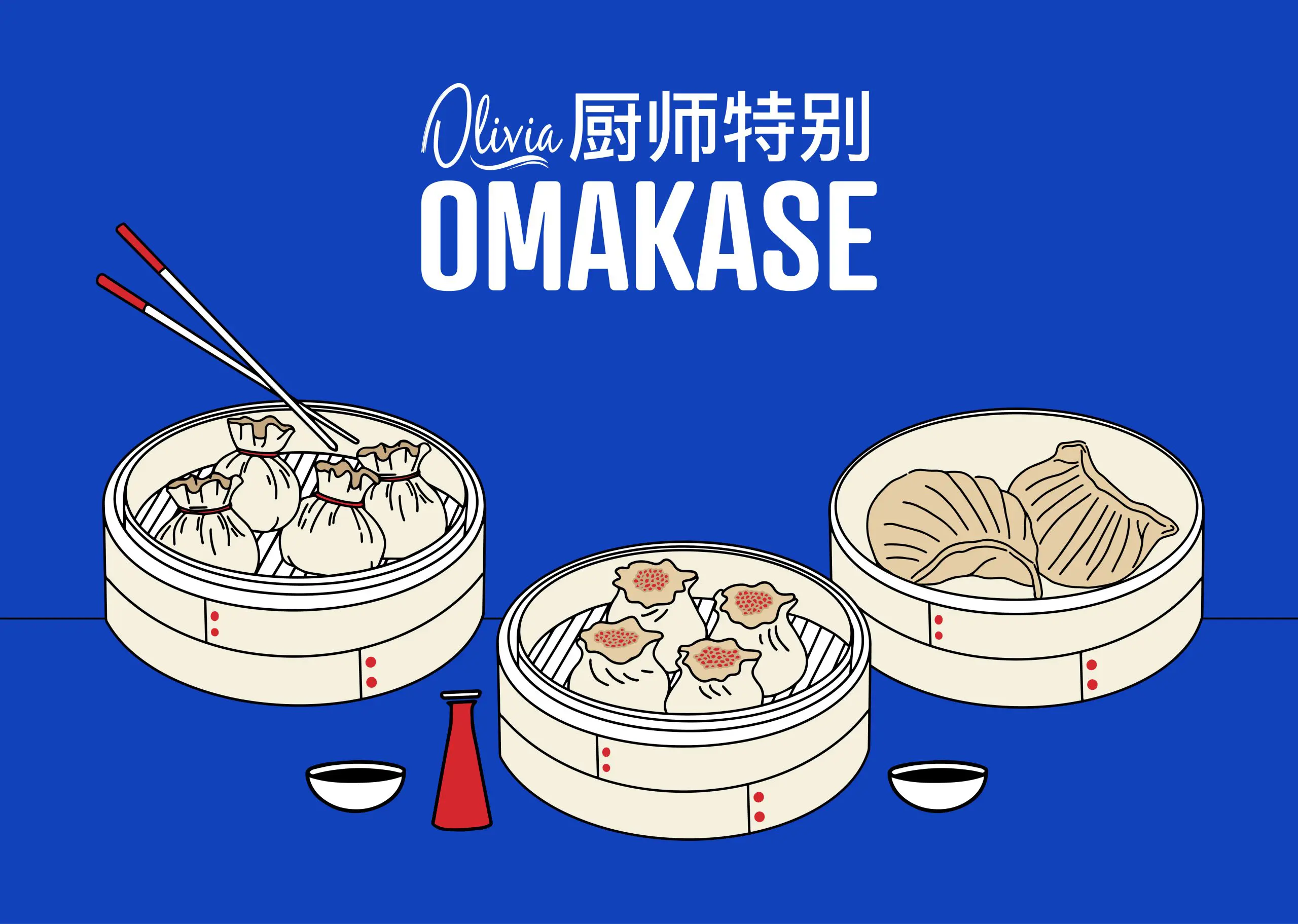
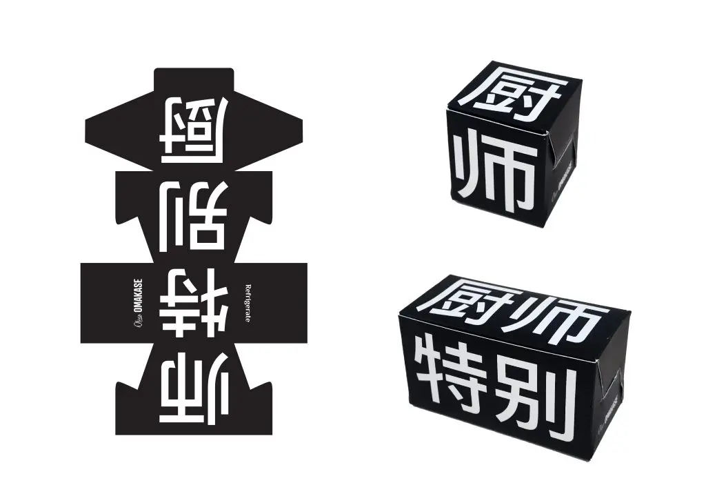
The brand’s logo is type-based and composed of three key components. The first is the parent brand name, “Olivia.” The second is the word “Omakase,” set in a bold sans-serif font for clarity and impact. The third element is the word Omakase rendered in Chinese characters, referencing the cultural history of the hero product.
Packaging Design Process
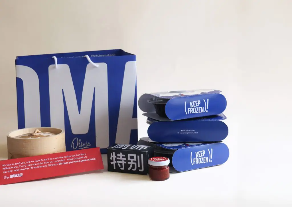
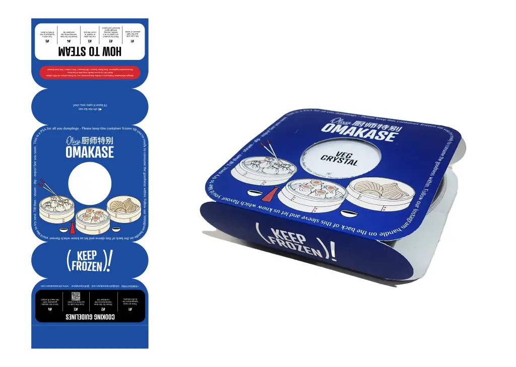
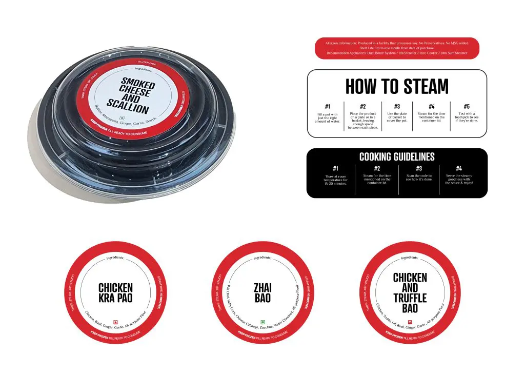
A seamless packaging experience not only gives the brand a definitive look but also solves practical challenges like storage, costing and consumer awareness. The packaging for Olivia Omakase communicates vital information regarding the product, including flavour, cooking instructions and other mandates in a way that is easily understandable and cost-effective. The dimsums are packaged in containers that are optimal for freezer storage without occupying too much space.
Packaging Design
When working on the packaging design for this project, the goal was simple — to offer the end user a holistic experience. Infused with quirky illustrations and playful typography, it captures our brand’s unique character. Clear communication ensures essential product details are conveyed, complemented by witty copy for a delightful surprise. The harmony of brand colours creates a visually appealing presentation, embodying our brand identity with sophistication and a clear distinction from the other product in its class.
Art Direction
For a spunky brand with a nuanced audience, the art direction exudes a delightful blend of fun, quirky and premium ambience. Through meticulously curated scenario-based setups, such as game nights and house parties, we brought to life the versatility of the brand’s products in real-life scenarios. The intentional use of a hard light setup adds an extra layer of depth and dimension, further enhancing the overall impact of the visuals.
Art Direction: Design Piñata
Photography: Harshika Tantia
Social Media - Launch Campaign
While working on the launch of Olivia Omakase, our approach was twofold — emphasise seamless execution and create an engaging experience. The core challenge was to ensure the launch resonated in the minds of our audience. To achieve this, we strategically devised three distinct phases. True to the Jester archetype of the brand, the first phase of the launch coincided with April’s Fool Day where select customers of Olivia Creamery were sent frozen dimsums in ice cream tubs. From anticipation to surprise and delight, the two successive phases of the launch progressed organically, unveiling Olivia Omakase in a manner that was not only engaging but also reflective of the brand’s journey.
Social Media
For a brand like Olivia Omakase, a social media strategy, as fresh as the product, was crafted — engaging, creative, and impactful. To achieve this, we addressed three key points: positioning the brand’s product as the top choice in its category, maintaining informative messaging in our punchy tone without sounding preachy, and standing out amidst the array of ready-to-eat frozen food options in the market.