JC Group of Companies has been part of Kolkata’s industrial field for decades and has grown into businesses that include finished leather manufacturing, leather accessories, PPE/safetywear, real estate and more.
A logo is the most effective representation of a brand’s identity. An origami bird with the focal point being its wings was chosen as a symbol for this ever growing and expanding company.
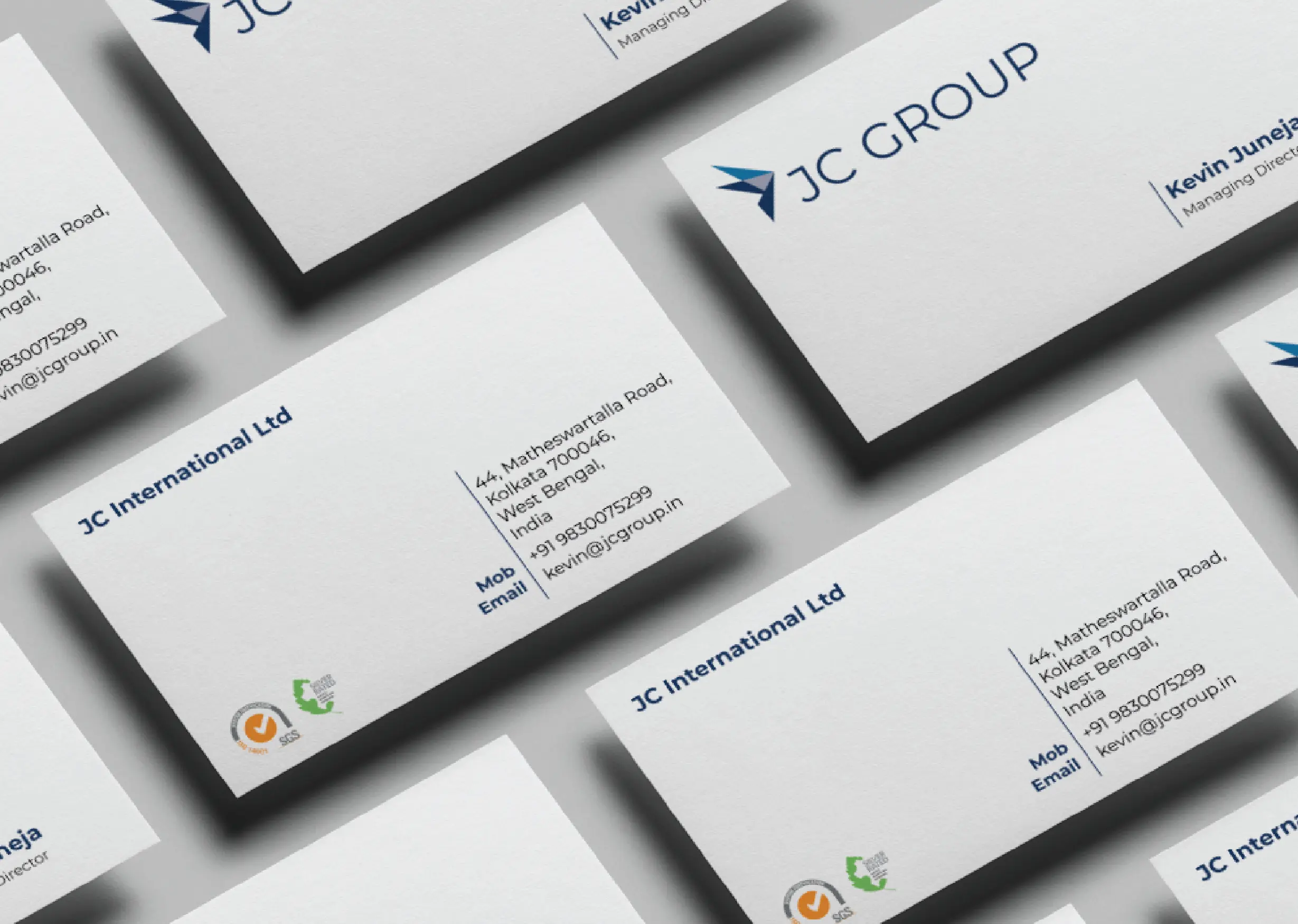
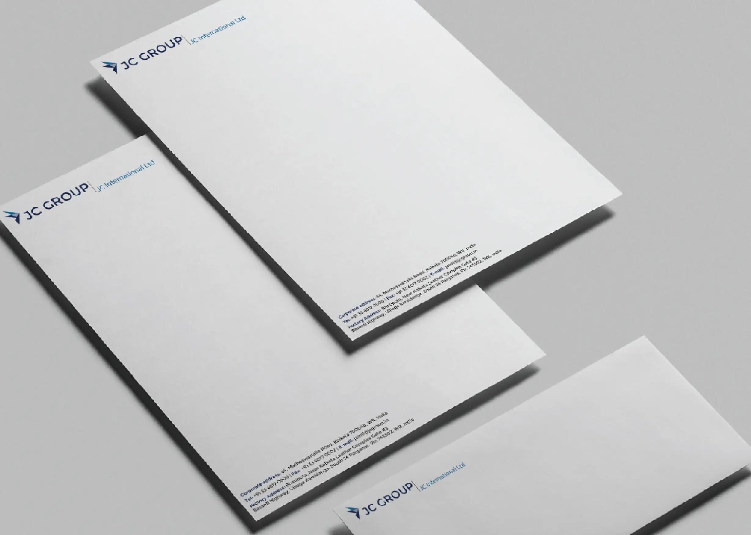
Print Design
An extension of the logo and brand colours was used to create stationery.
Website Design
For a corporate look, the website was slick, to the point in look and language, and without any unnecessary details.