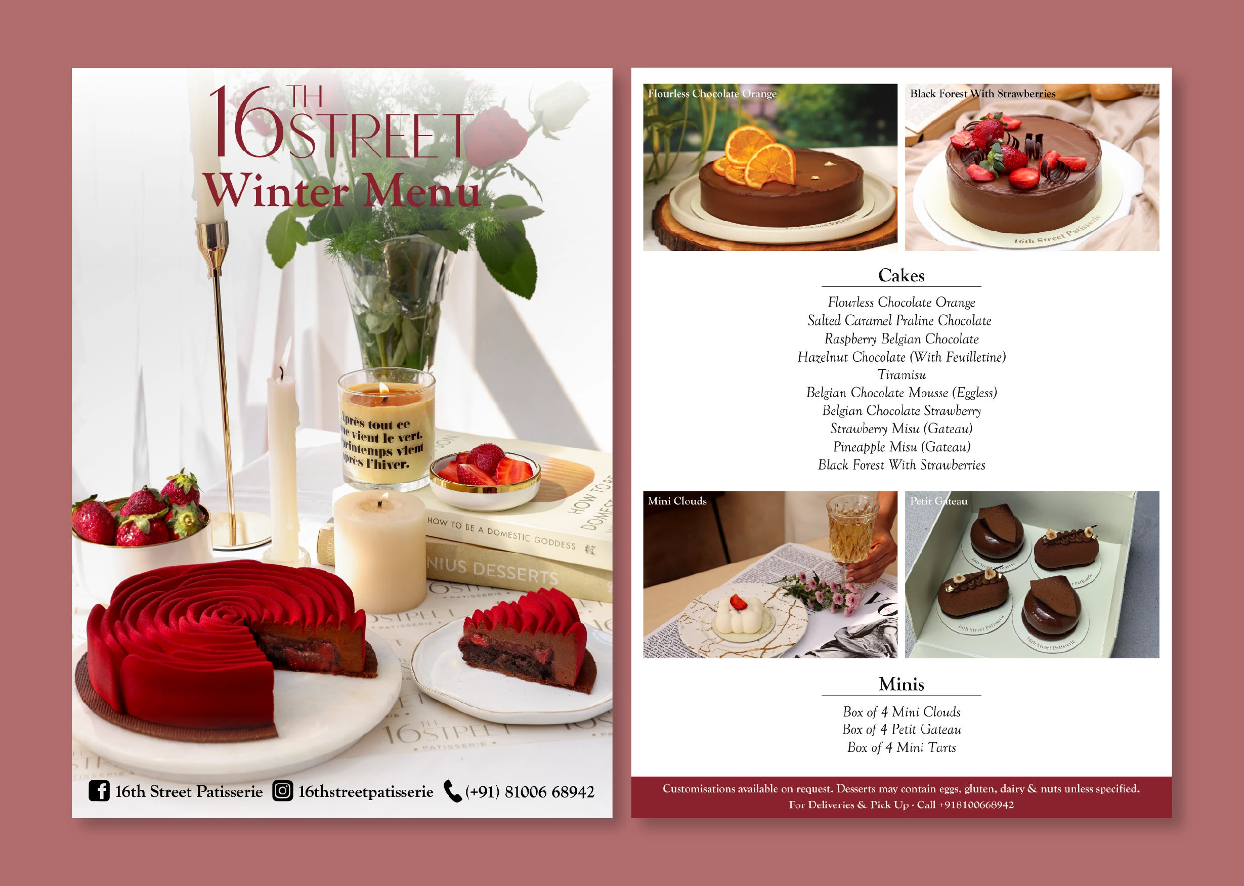
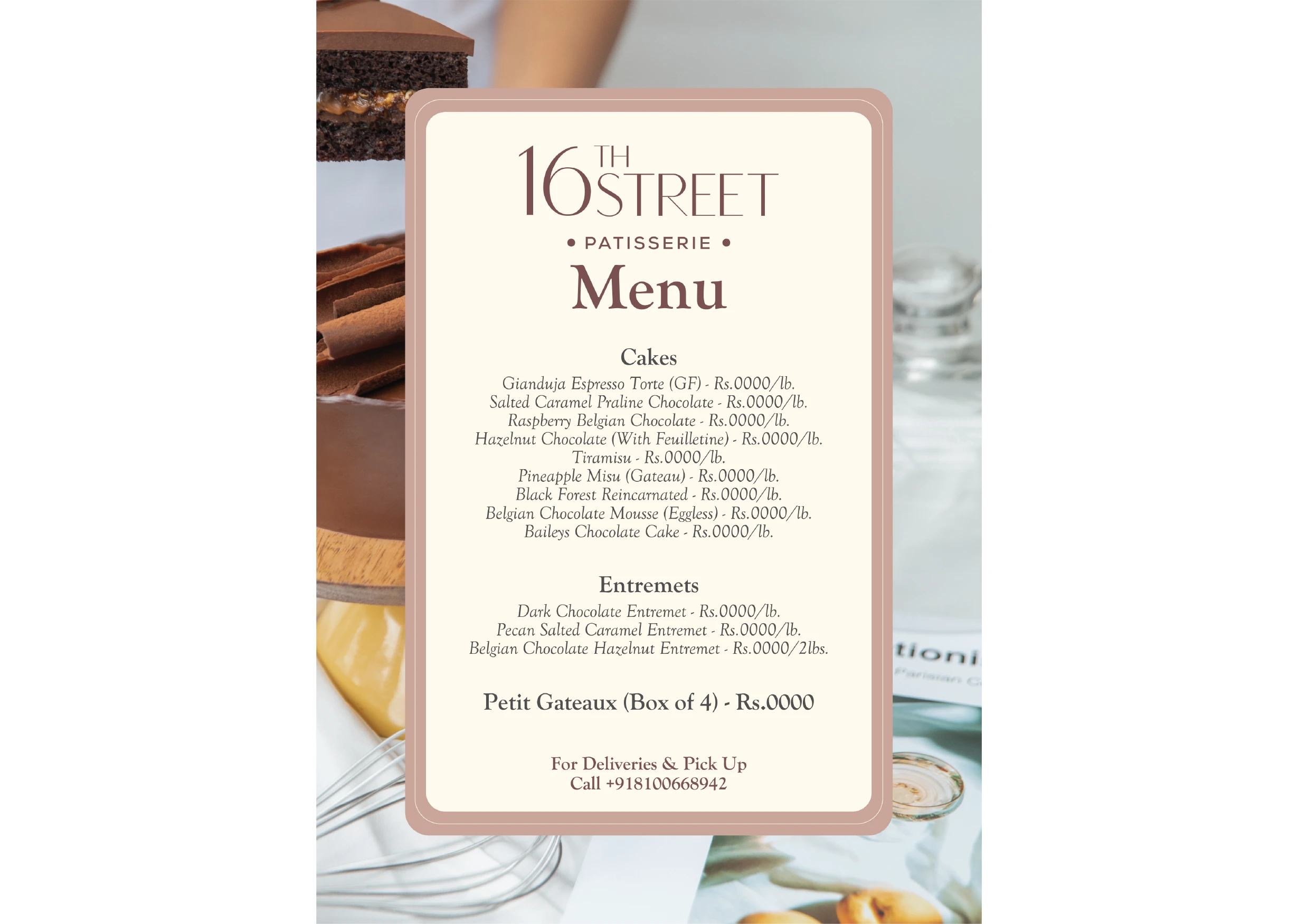
An editorial style catalogue was designed to supplement the brand’s physical pop-up at The India Story. Staying true to the brand’s luxury lifestyle approach, the catalogue takes the reader through its dessert offerings with the ease of flipping a magazine.
Packaging Design - Festive
When designing festive packaging, we want to incite warmth, deep gratitude, and timeless memories of joy. The route chosen was of quiet luxury which is expressive, rich, and minimal. The palette centres on a deep, lacquered red, chosen for its timeless elegance rather than traditional festive cues. Clean white linework and pearl-like accents soften the look, keeping it refined, warm, and aligned with the patisserie’s Paris-inspired aesthetic.
Art Direction (Photography)
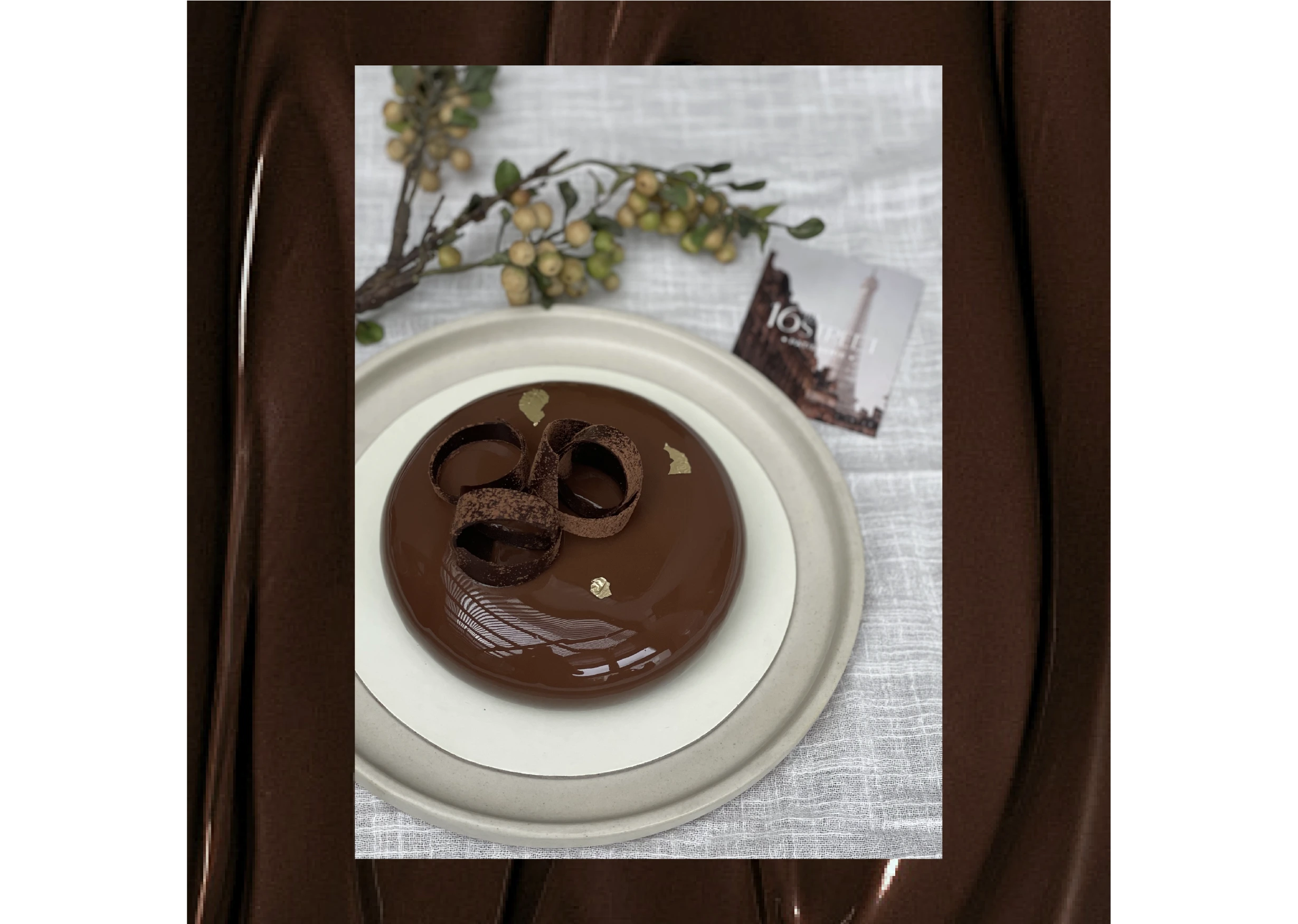
The art direction involved creating frames around classic European textures with polished surfaces, soft pearls, candlelight, and flowers to create an atmosphere that feels intimate and celebratory.
Concept & Art Direction: Design Piñata Photography: Harshika Tantia
Art Direction (Videography)
Videography: Raptos Studios
Social Media
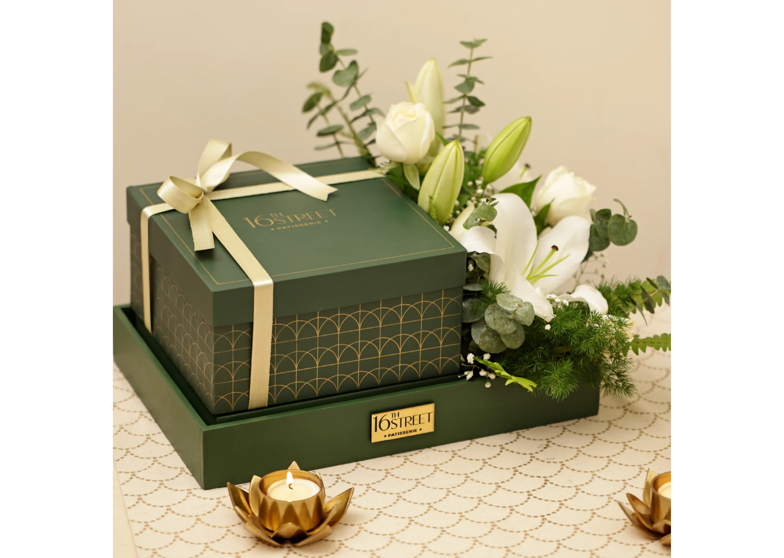
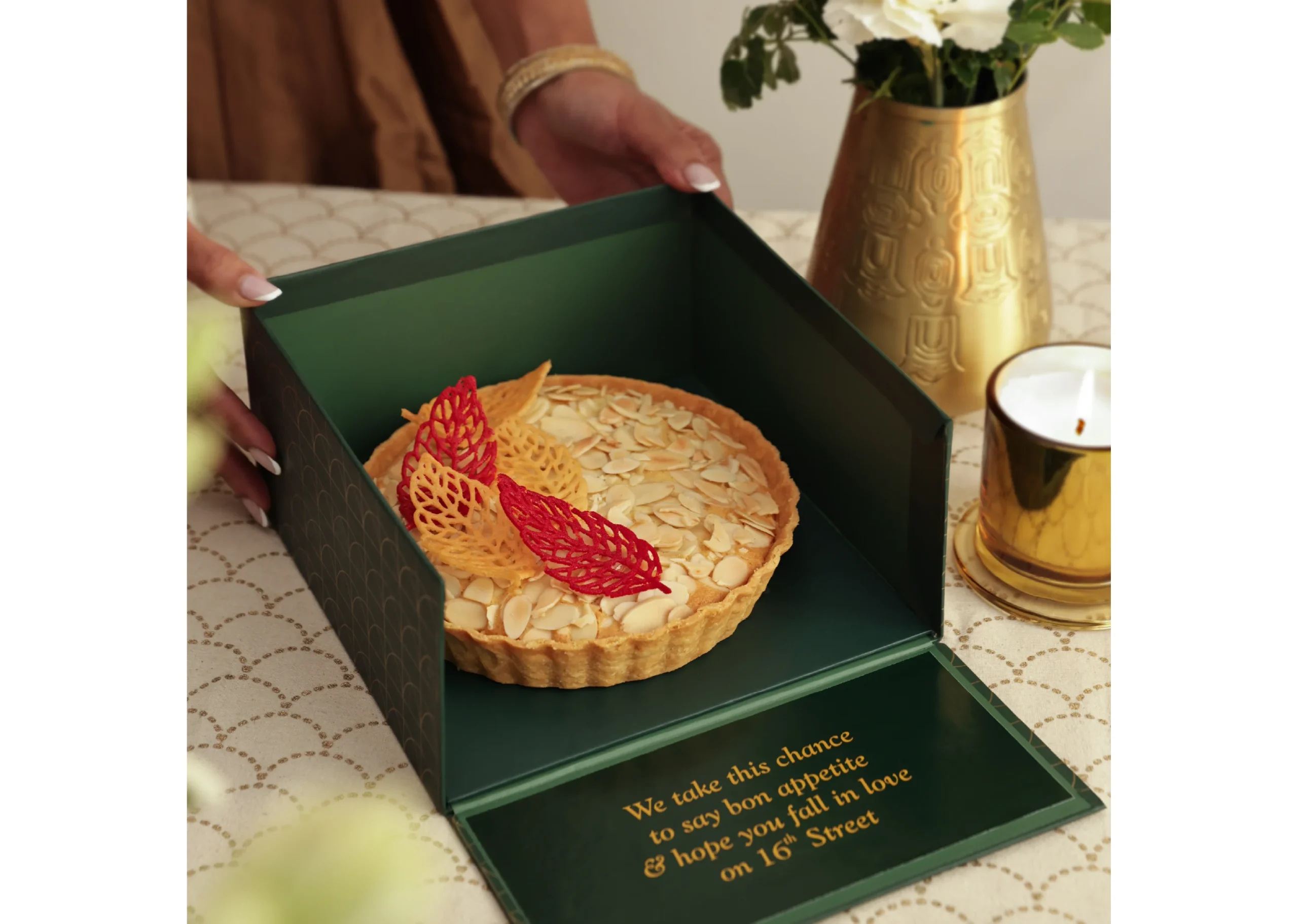
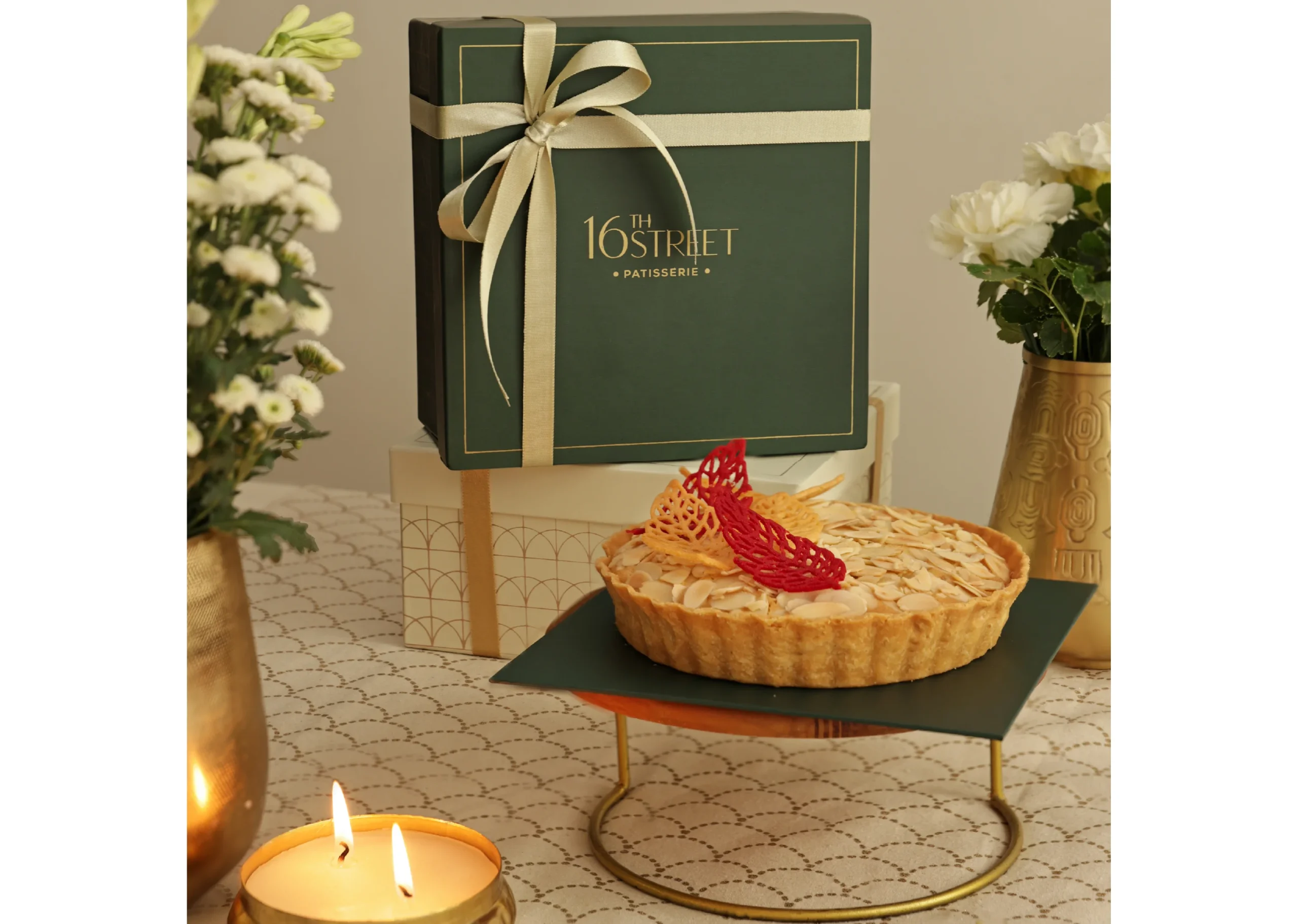
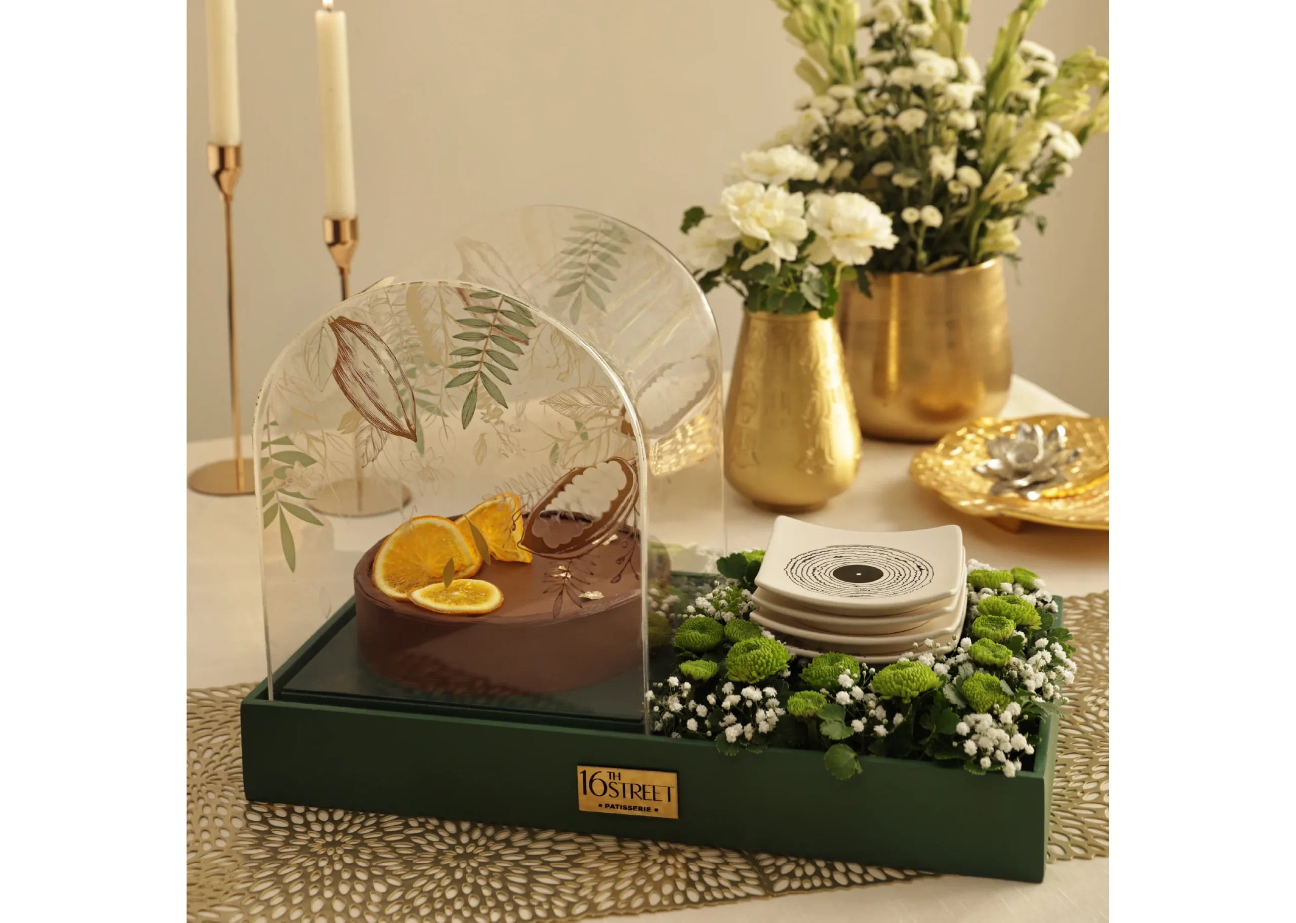
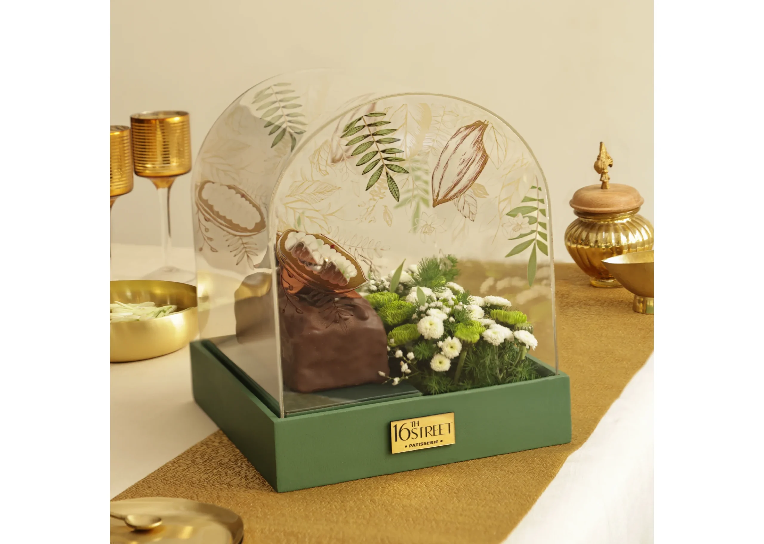
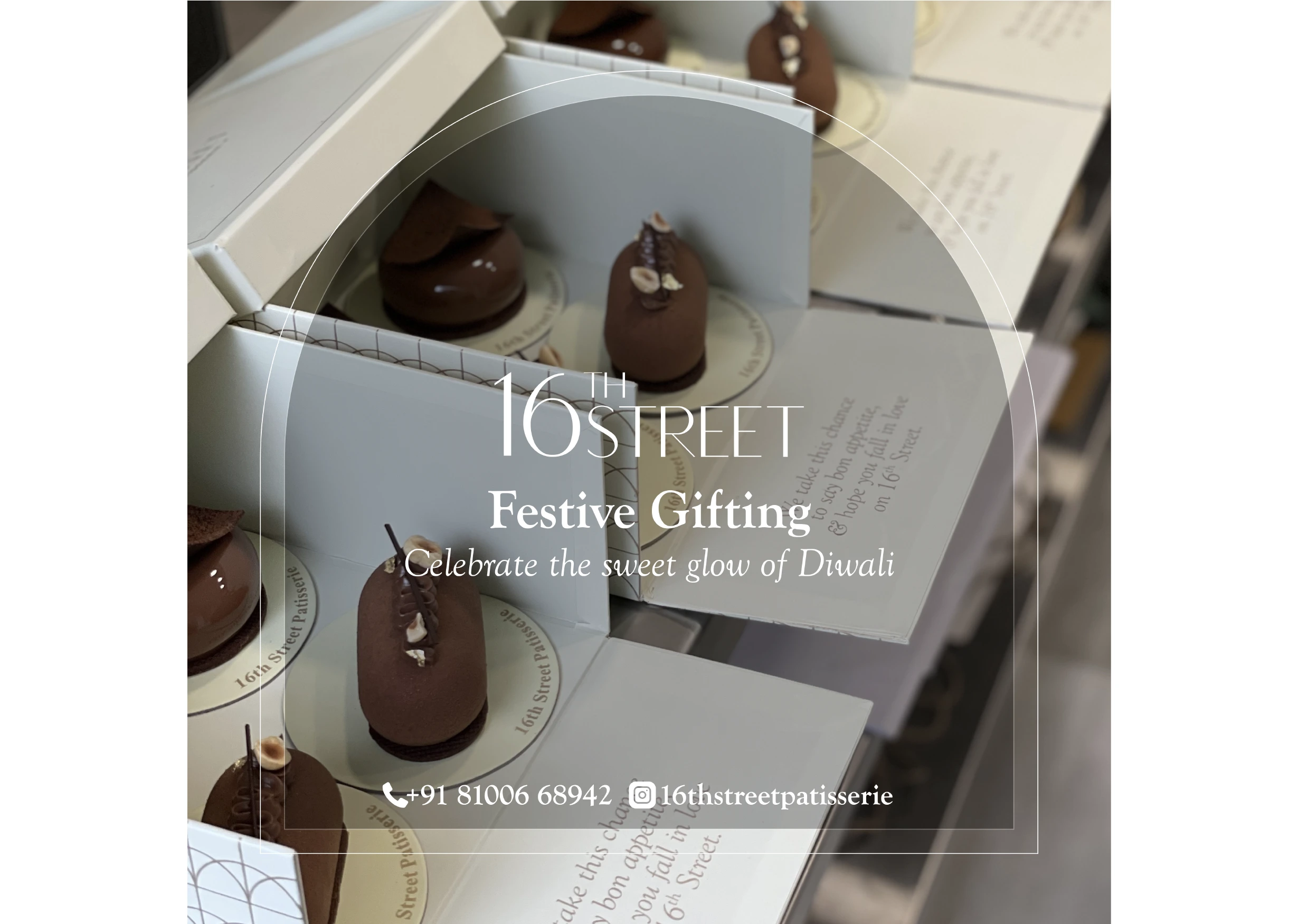
With Diwali around the corner, it was time to spruce things up for the brand. The classic ivory gift box was now replaced with an emerald green. Standard hampers with flowers (common;y seen around the festive season) received an extra dose of luxury with acrylic arches that had hand illustrated designs on them, making them unique to the brand.
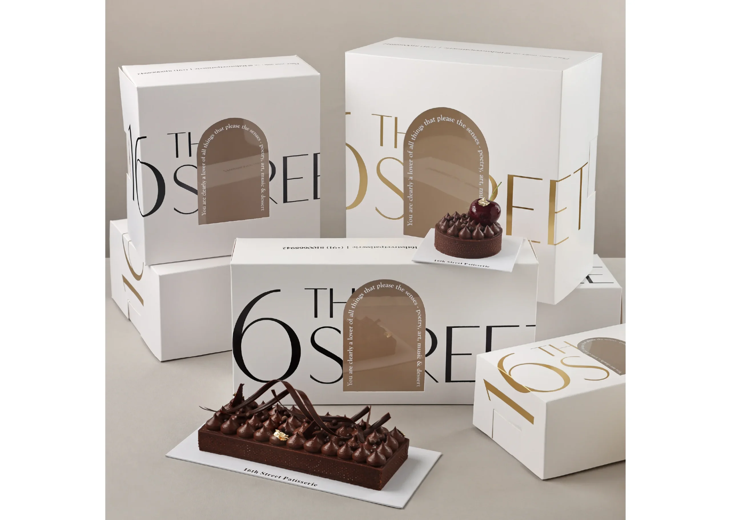
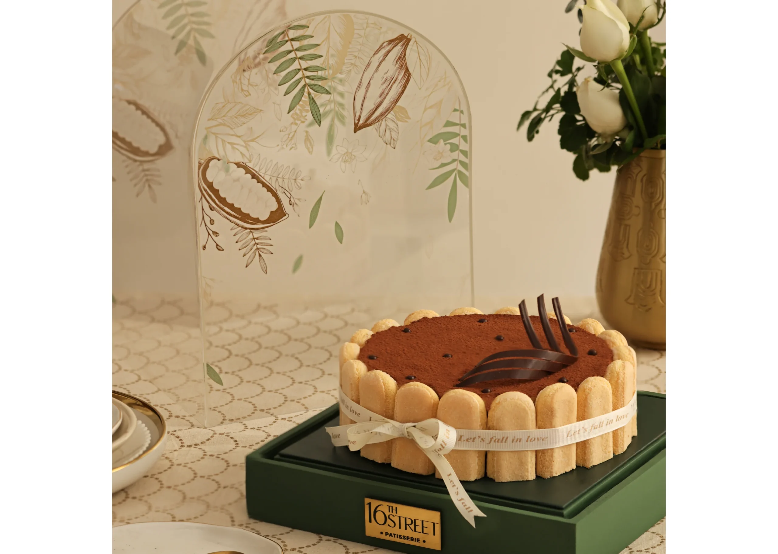
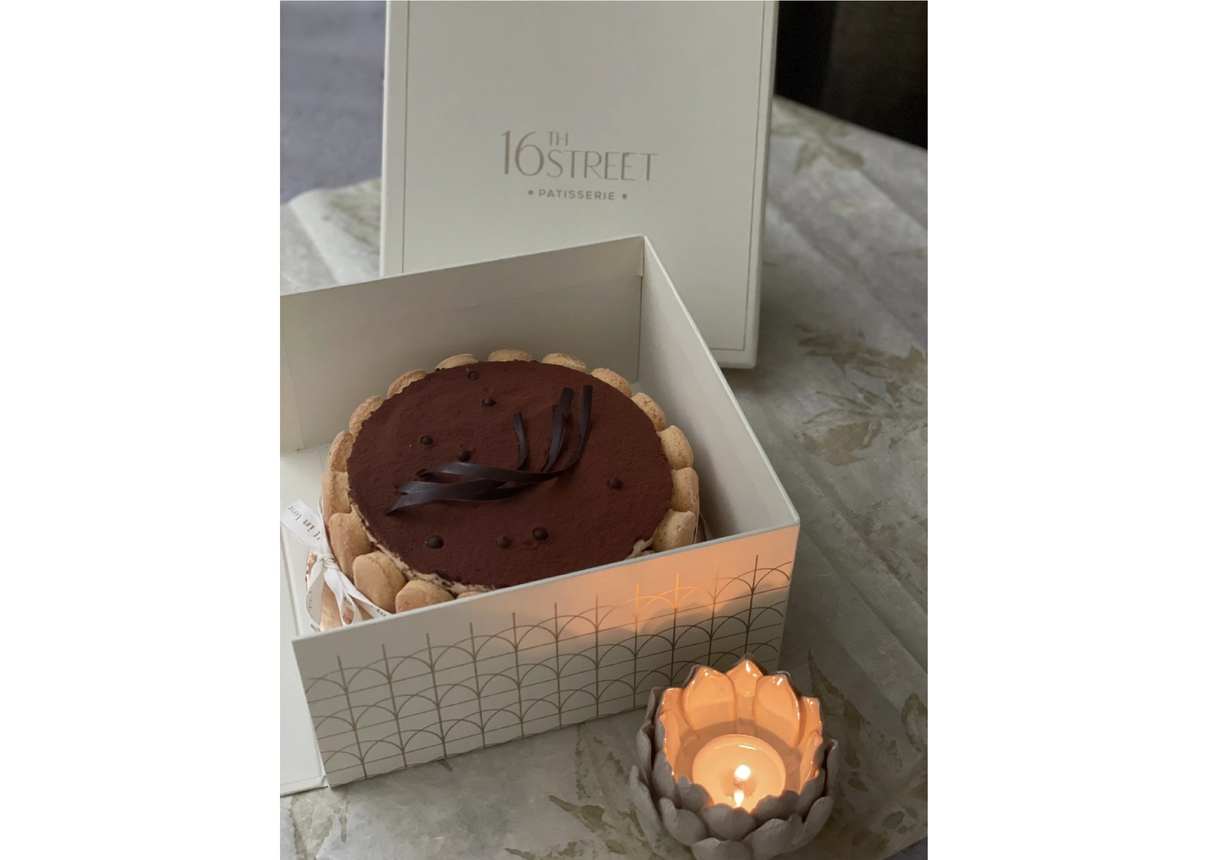
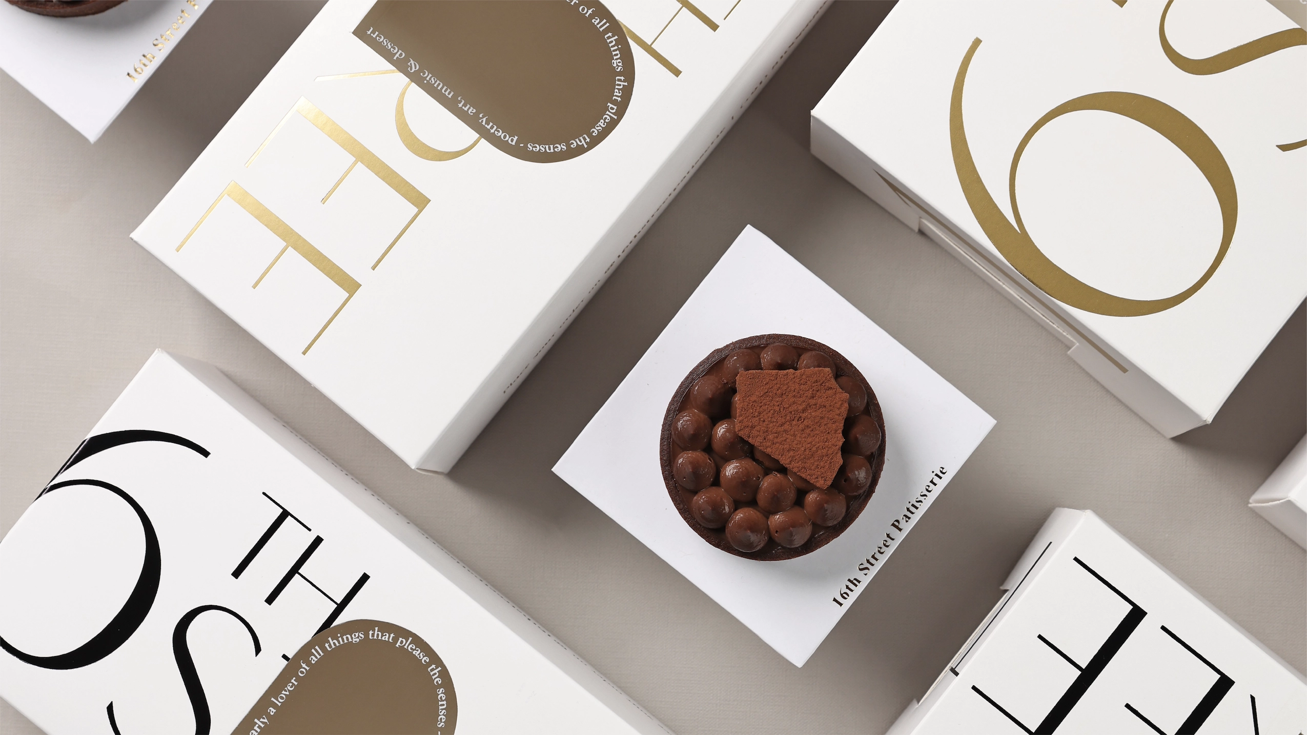
When designing packaging, we always think of the experience. The challenge is to always create packaging that pairs sumptuously with the desserts. The iconic arched window of 16th Street remains an inspiration for us to reinvent and translate in a multitude of ways, offering a peek into the boxes, as a cloche veiling the dessert and as a pattern around the box.
Packaging Design - Festive
With Diwali around the corner, it was time to spruce things up for the brand. The classic ivory gift box was now replaced with an emerald green. Standard hampers with flowers (commonly seen around the festive season) received an extra dose of luxury with acrylic arches that had hand illustrated designs on them, making them unique to the brand.
Art Direction (Photography)
For this particular shoot we referenced Renaissance paintings while recreating a corner in a French parlour. Antique silverware, decorative frames, candles and ribbons, all balance out the maximalism of Renaissance art with the minimalism of 16th Street.
Concept & Art Direction: Design Piñata Photography: Harshika Tantia
Art Direction (Videography)
Videography: Raptos Studios
Social Media
The beauty of the social feed is how the brand identity is extended over time, while the mood and brand voice remain constant.
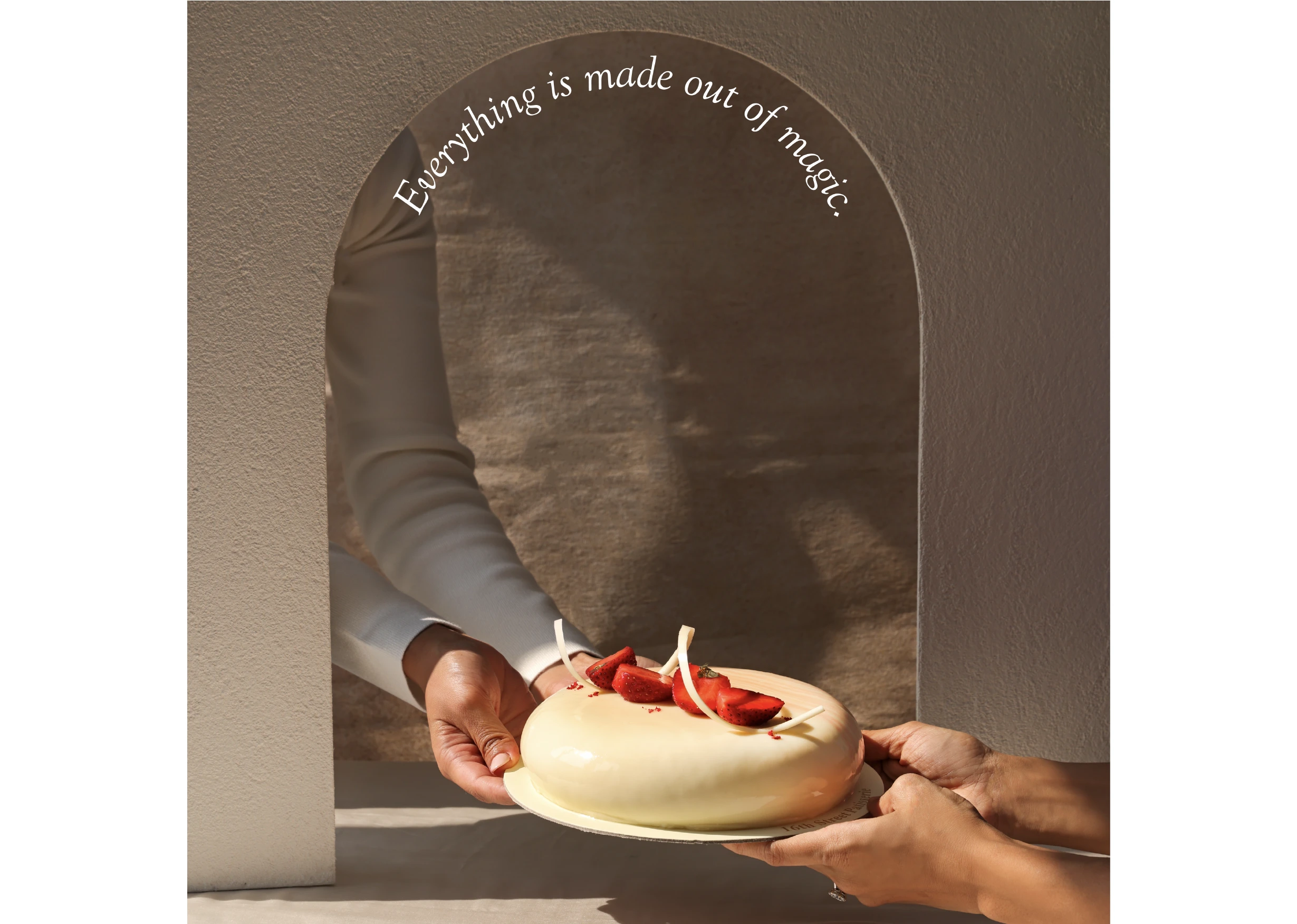
Utilising the arch which is central to the brand’s visual identity, we created imagery that uniquely belongs to the brand and reinforces the brand language. Bold colours and outdoor settings were used to create a festive mood for the shoot.
Art Direction: Design Piñata Photography: Harshika Tantia
SOCIAL MEDIA - Menu Design
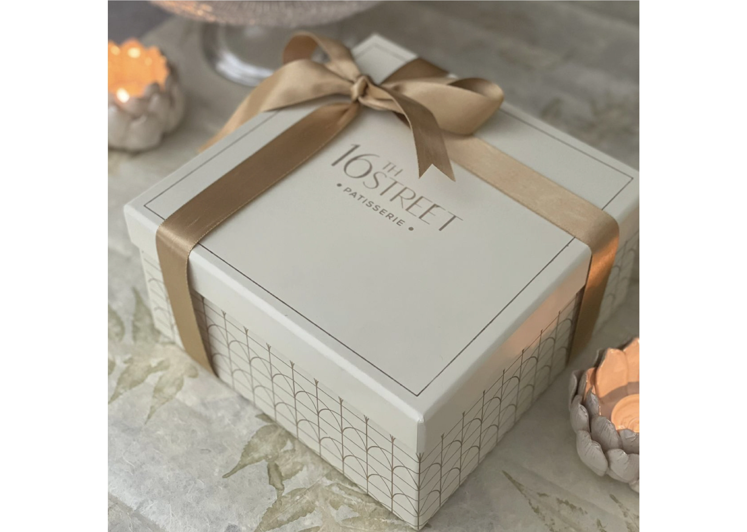
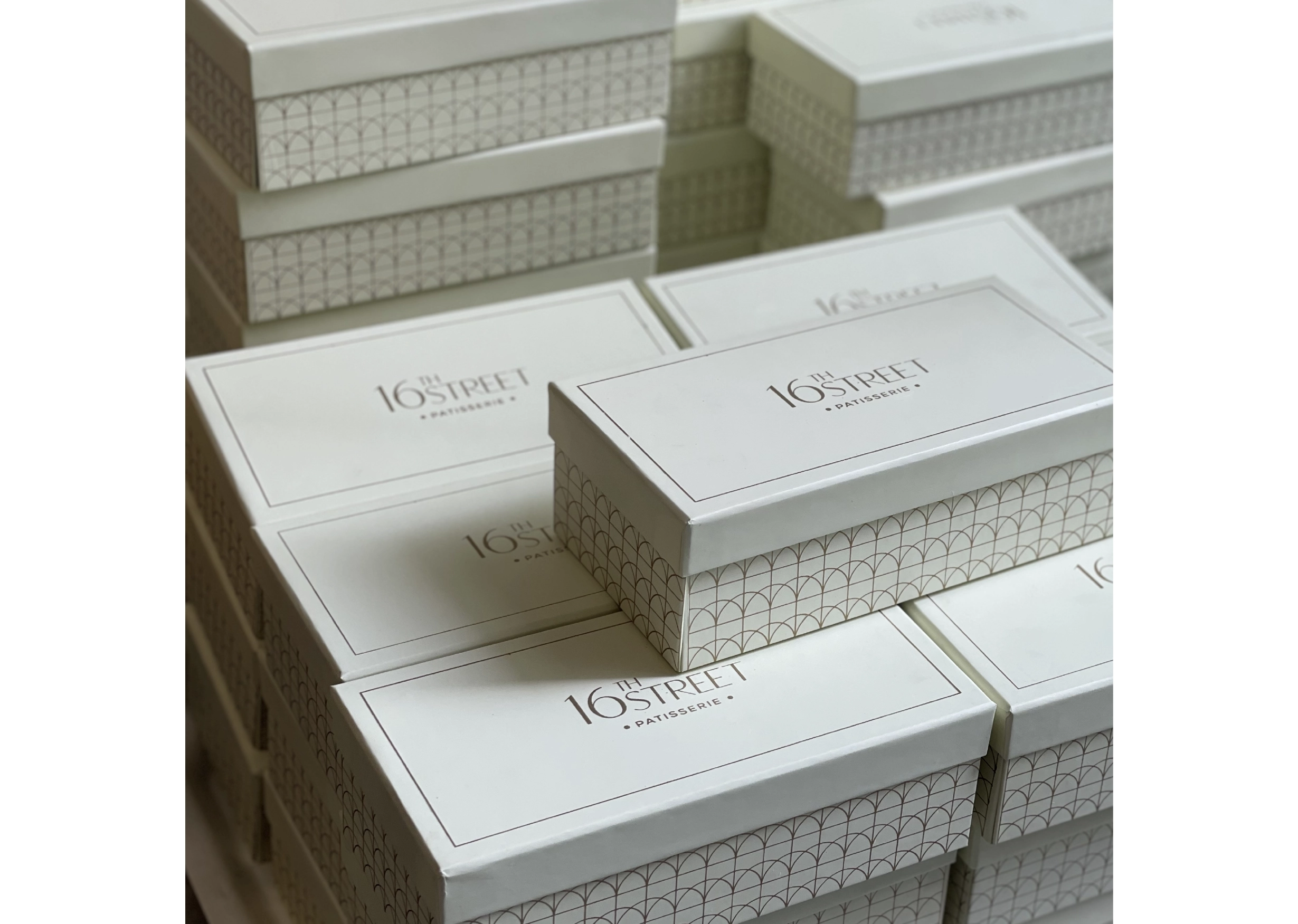
The window created as a part of the brand’s logo was made into a pattern, and applied onto packaging boxes.
Social Media
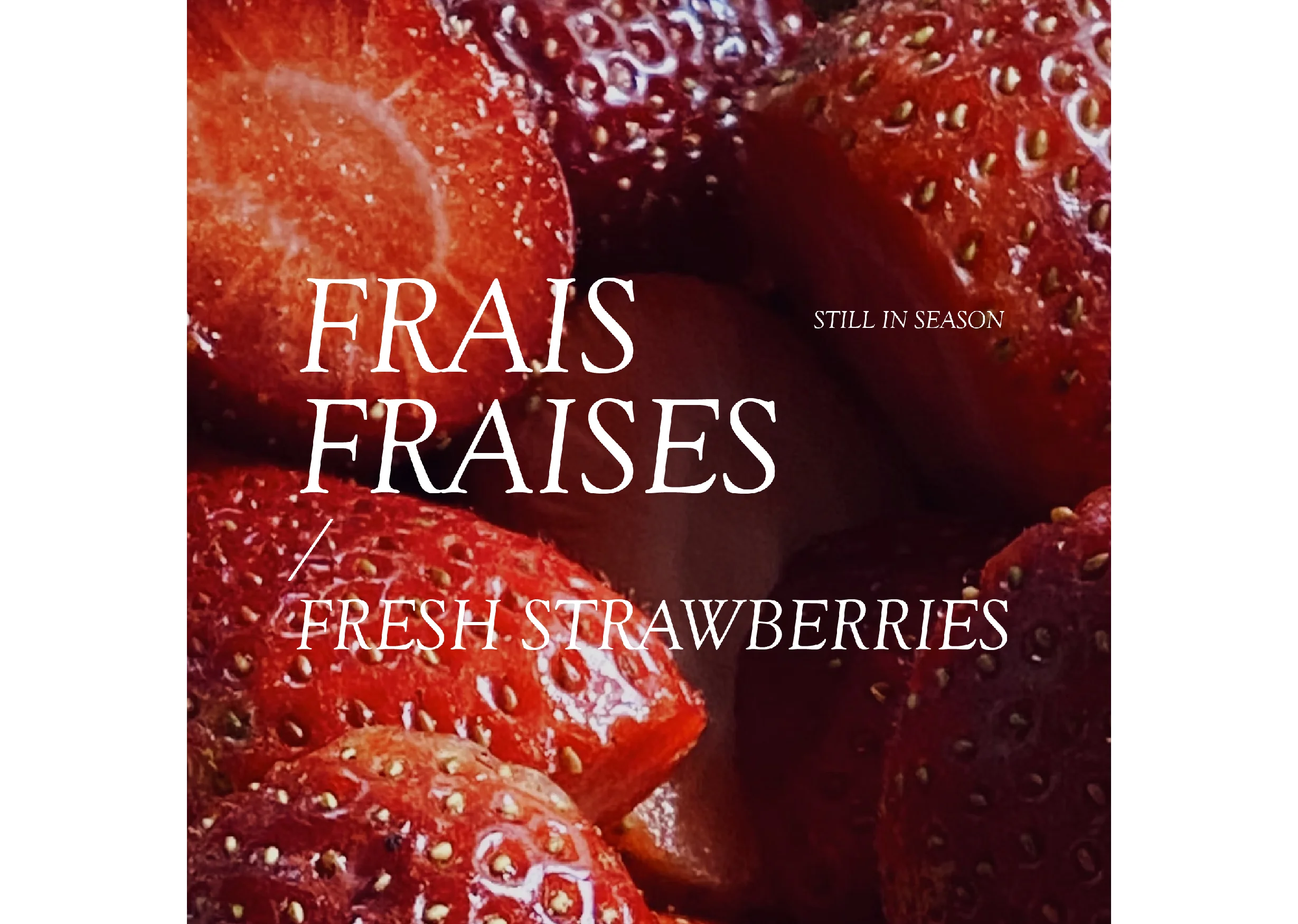
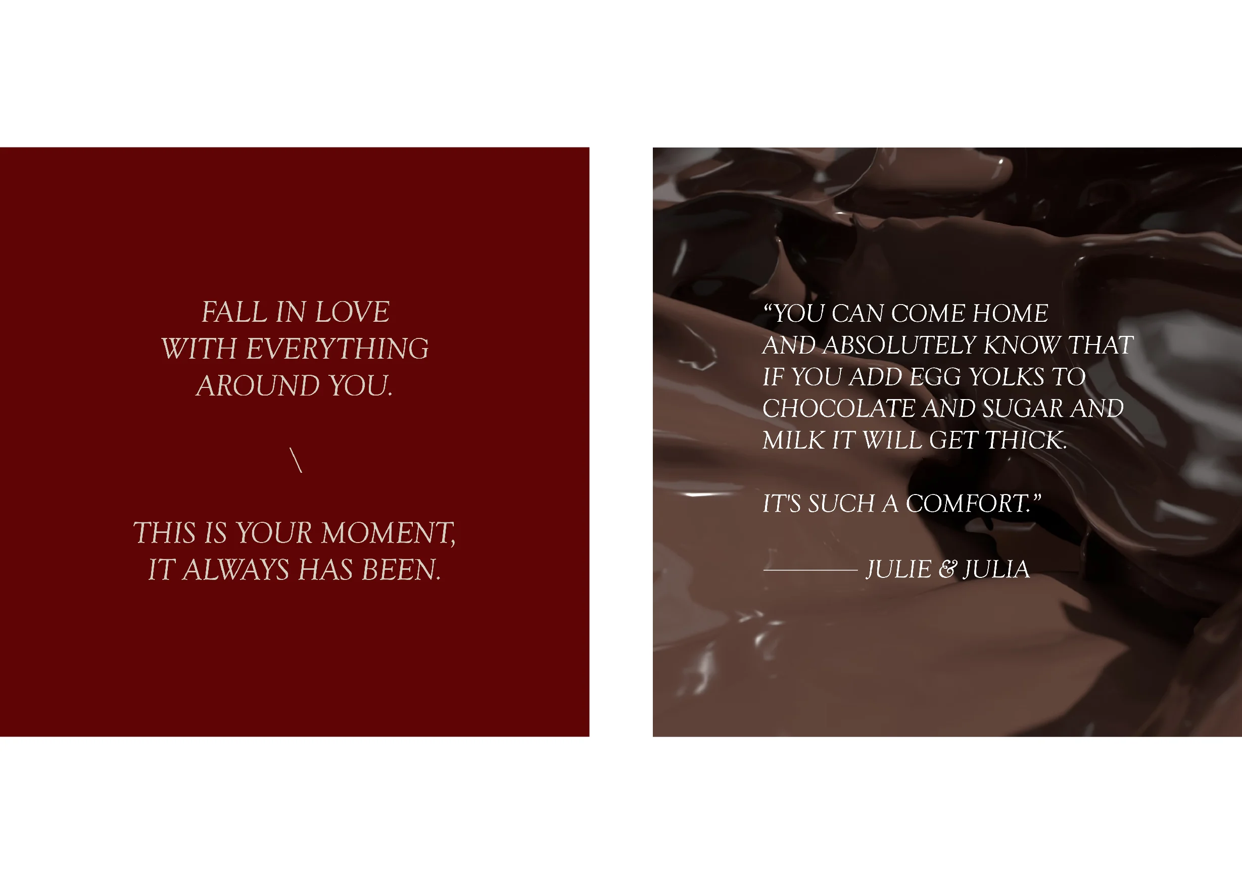
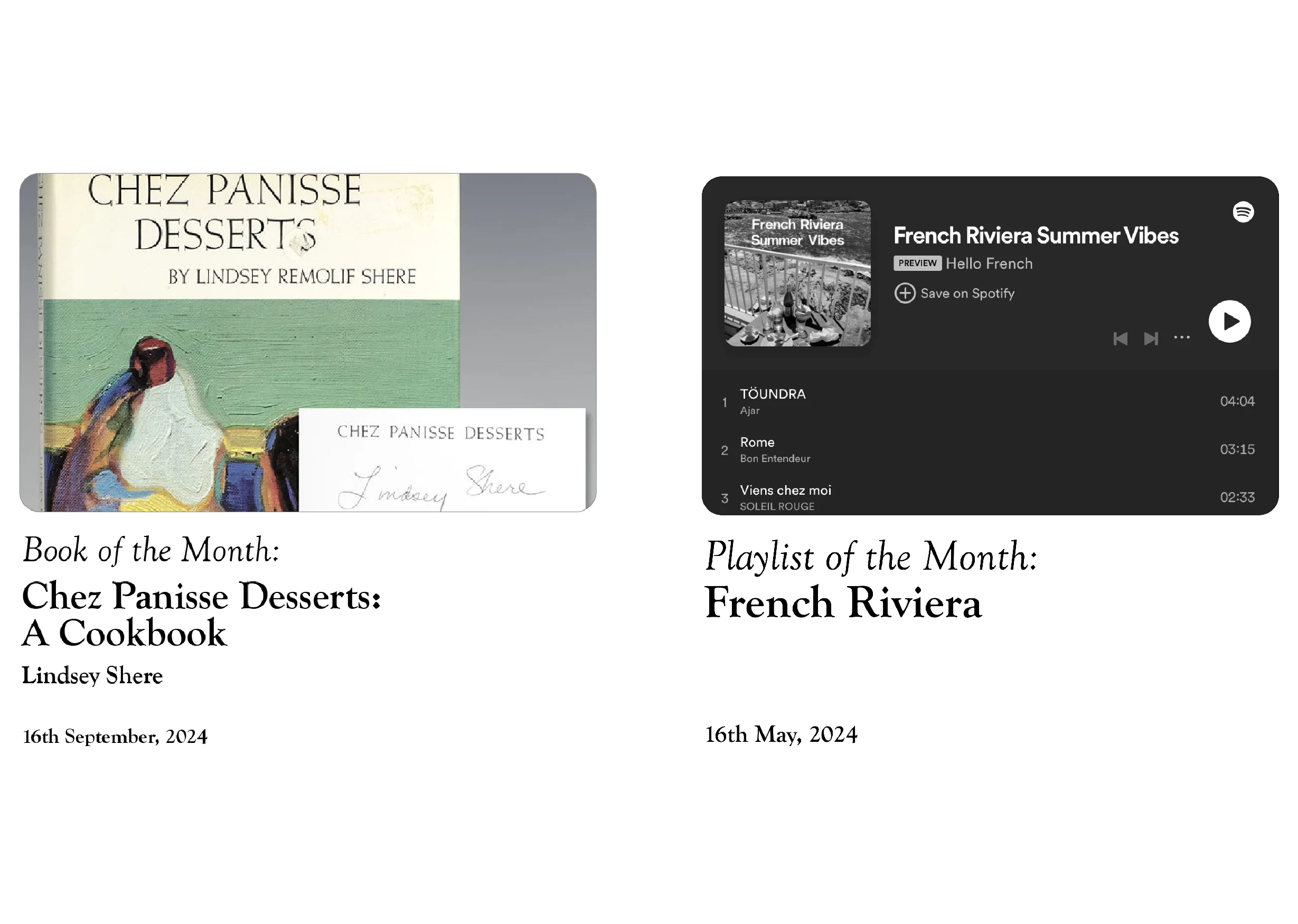
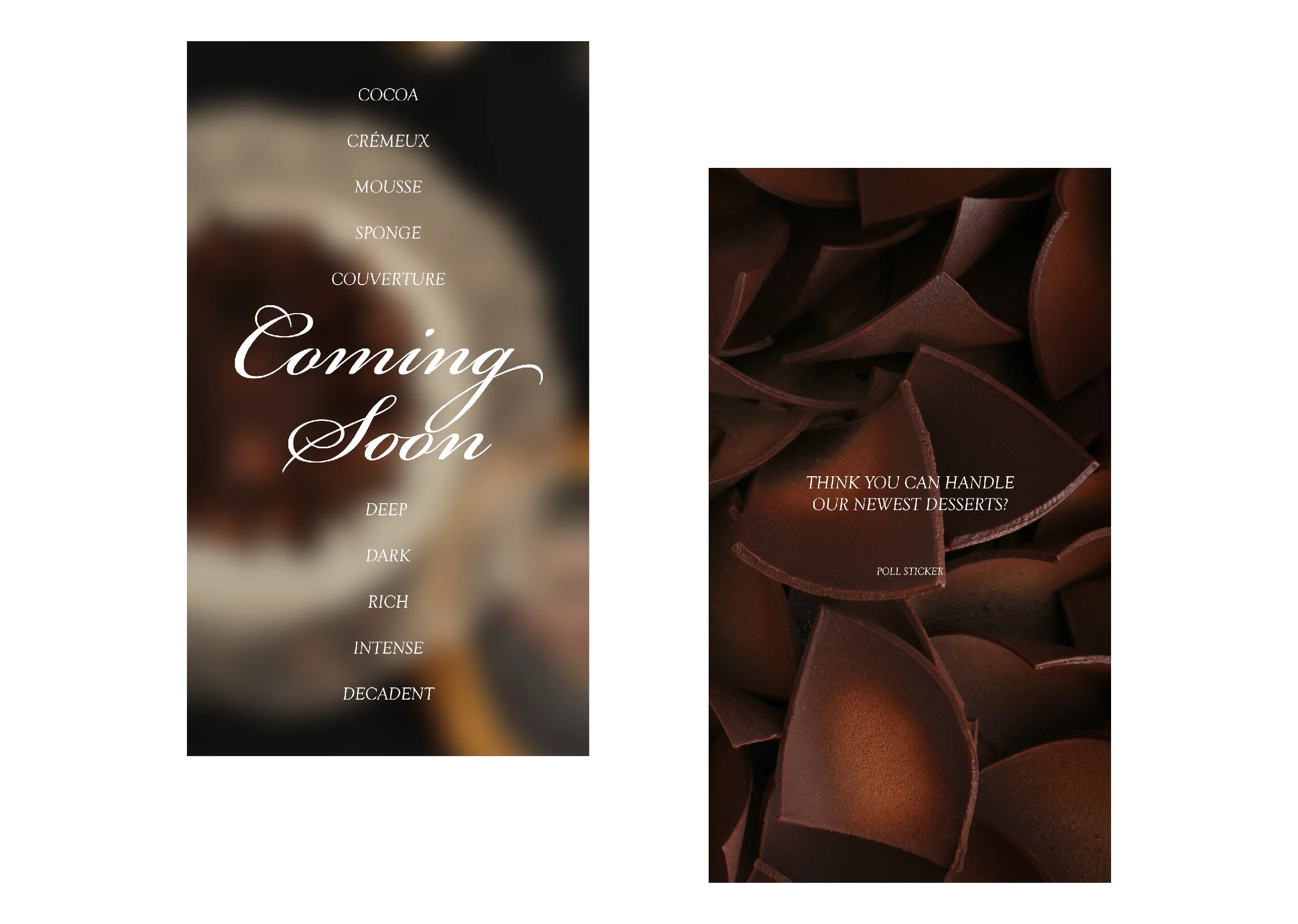
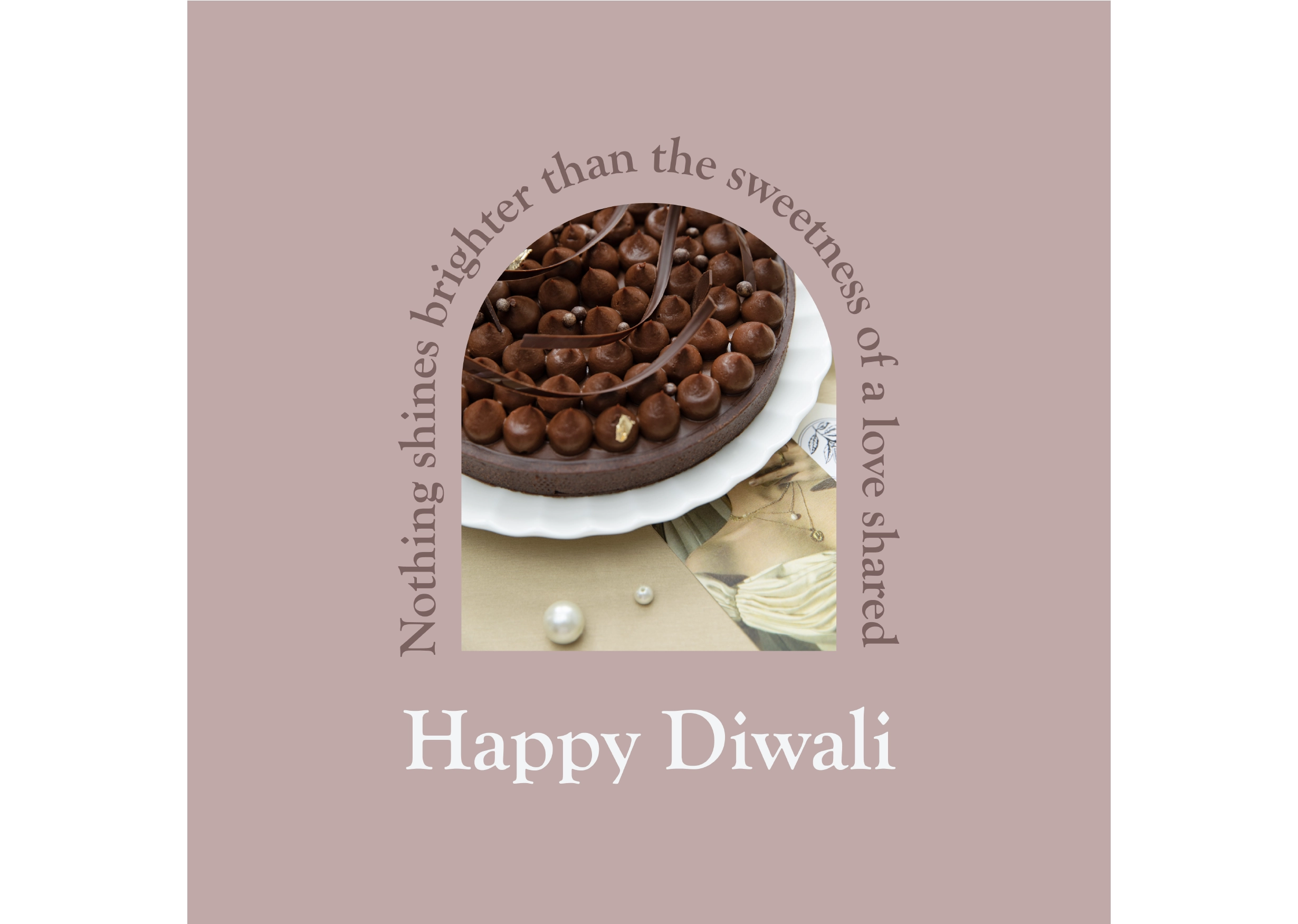
Solidifying 16th Street’s digital presence further, our stories express the brand’s love of all things aesthetic, sinful and delicious. With imagery that is evocative of the lifestyle endorsed by the brand and visual elements like the arched window, the social media feed is a depiction of the rich indulgence aroused by the desserts.
The window created as a part of the brand’s logo was made into a pattern, and applied onto packaging boxes.
Art Direction
The art direction for 16th Street projects a way of life rather than just capturing products. The imagery evokes layered emotions, much more than simply happiness.
Concept & Art Direction: Design Piñata Photography: Harshika Tantia
Social Media - Menu Design
Lorem ipsum dolor sit amet, consectetur adipiscing elit. Ut elit tellus, luctus nec ullamcorper mattis, pulvinar dapibus leo.
Social Media
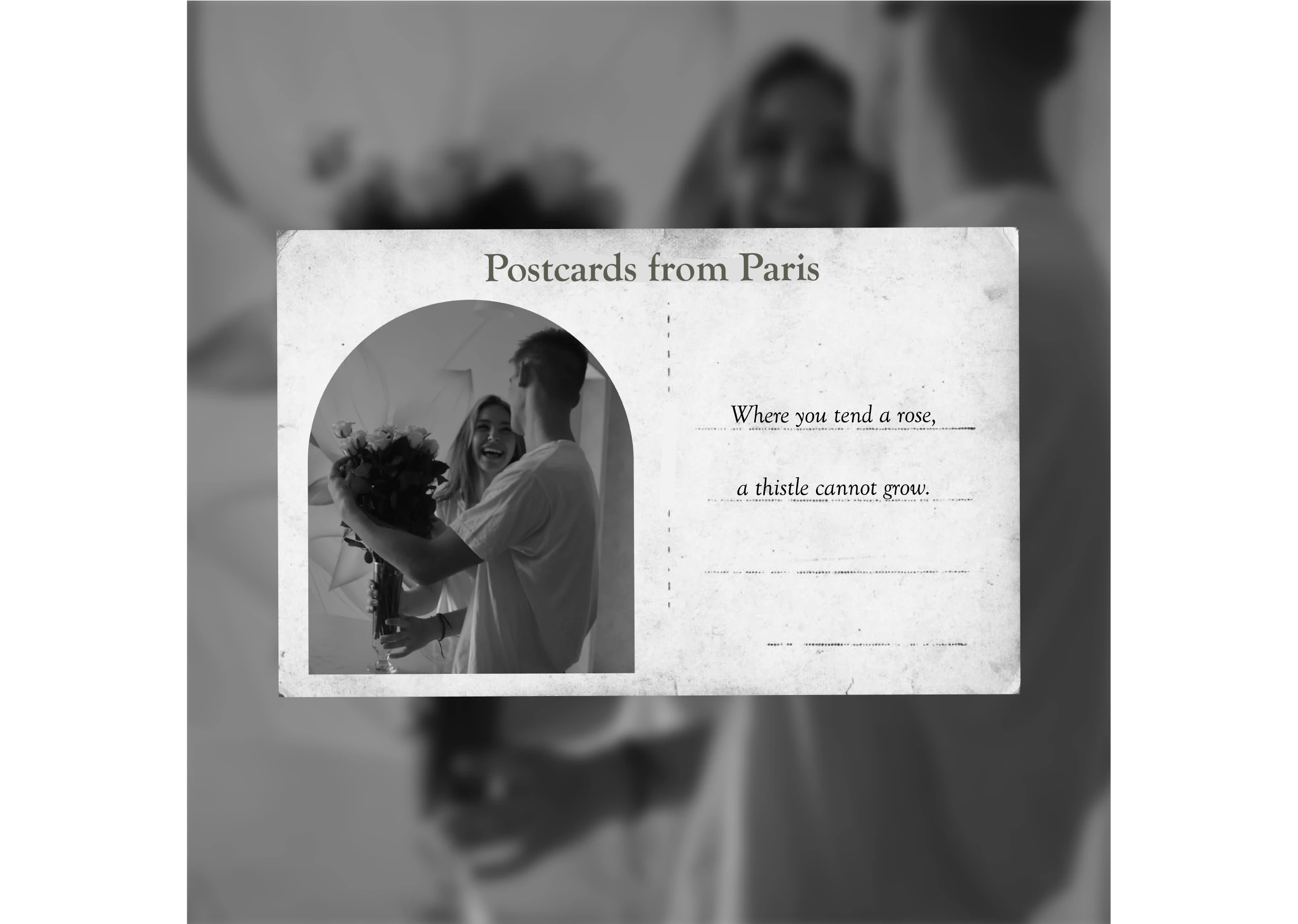
The idea behind the brand’s digital presence was to tell the founder’s story of falling in love with desserts, travel and a Bohemian way of life. We have played with doublespeak, keeping things tongue-in-cheek as the approach for this page was through a dreamy Parisian lens.
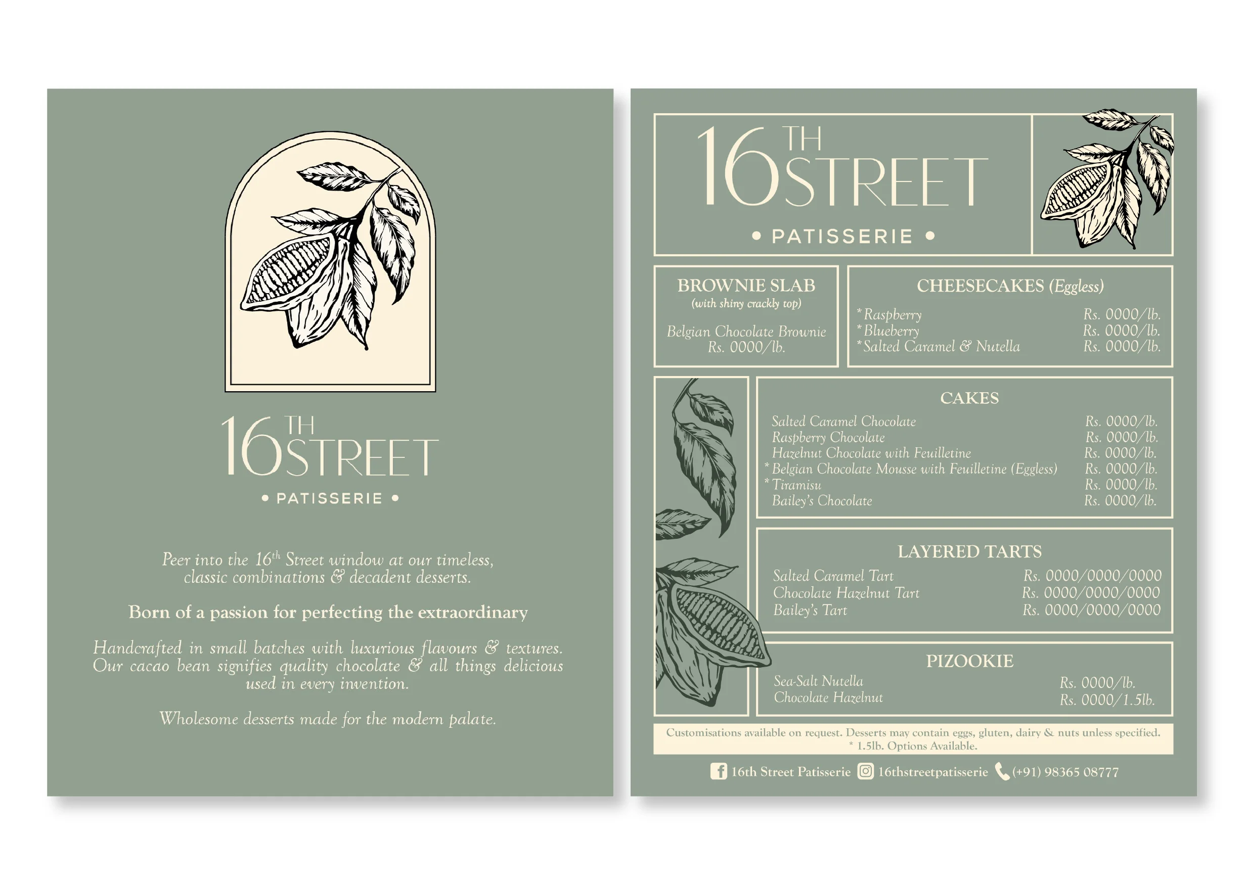
For the logo unit we were inspired by a glass cloche and used an arched window to create a versatile design that allowed us to extend the brand story further. The illustration of the cacao bean signifies the use of quality chocolate and all things delicious in every invention.






Social Media