SCOPE OF PROJECT:
Brand Identity
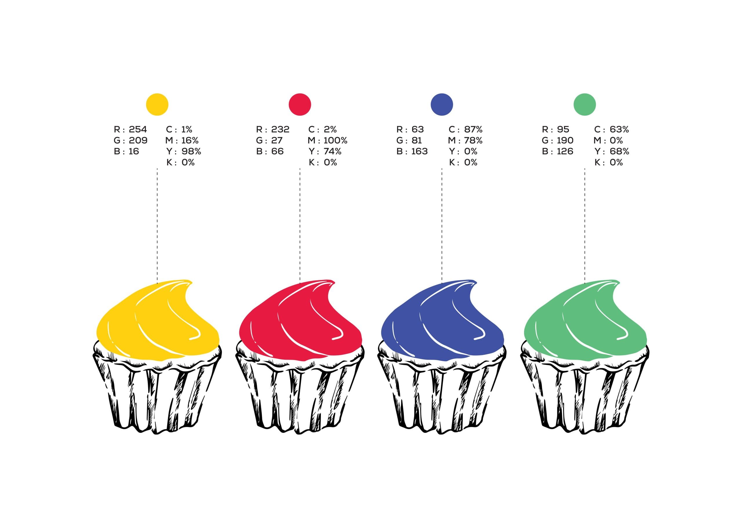
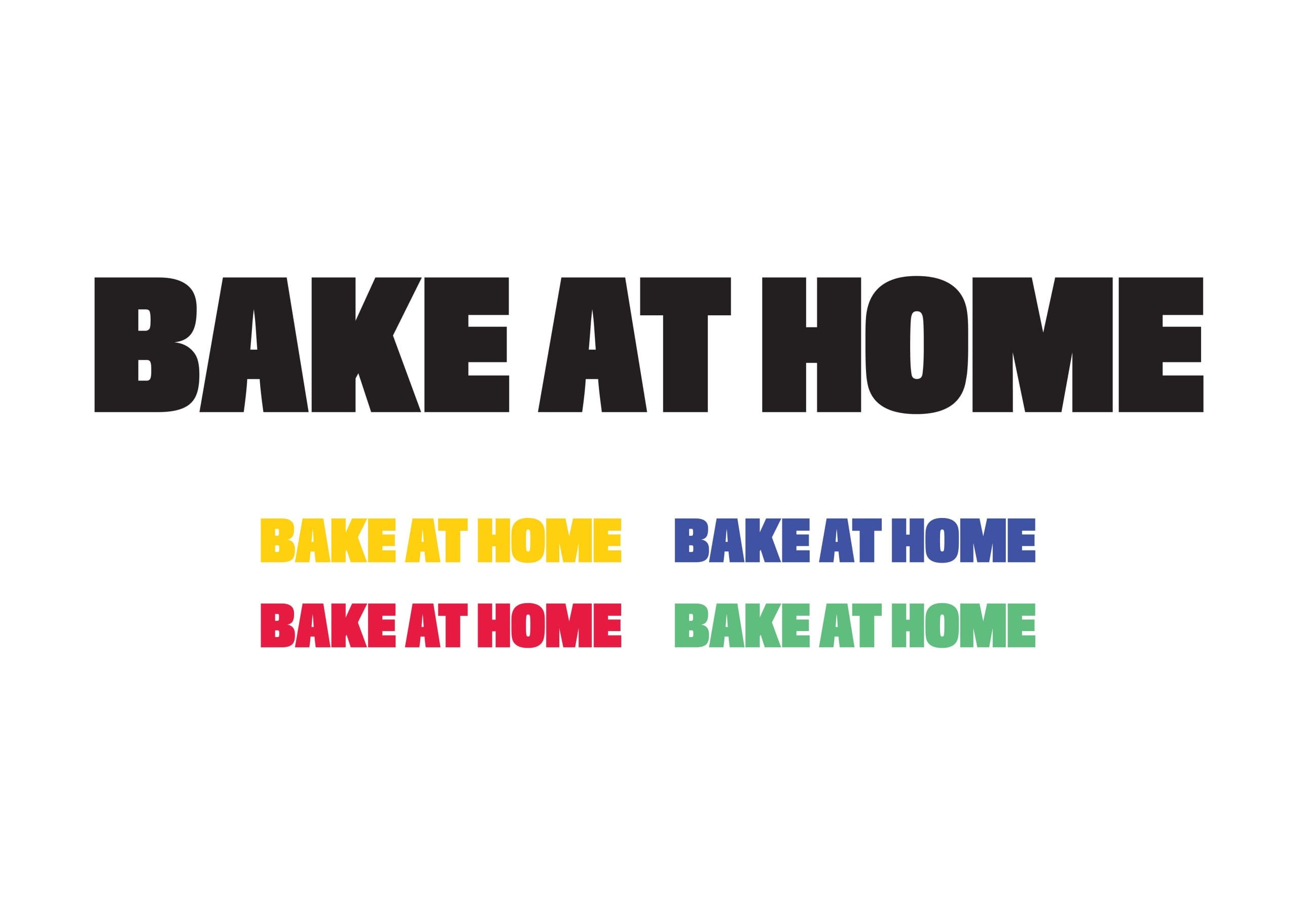
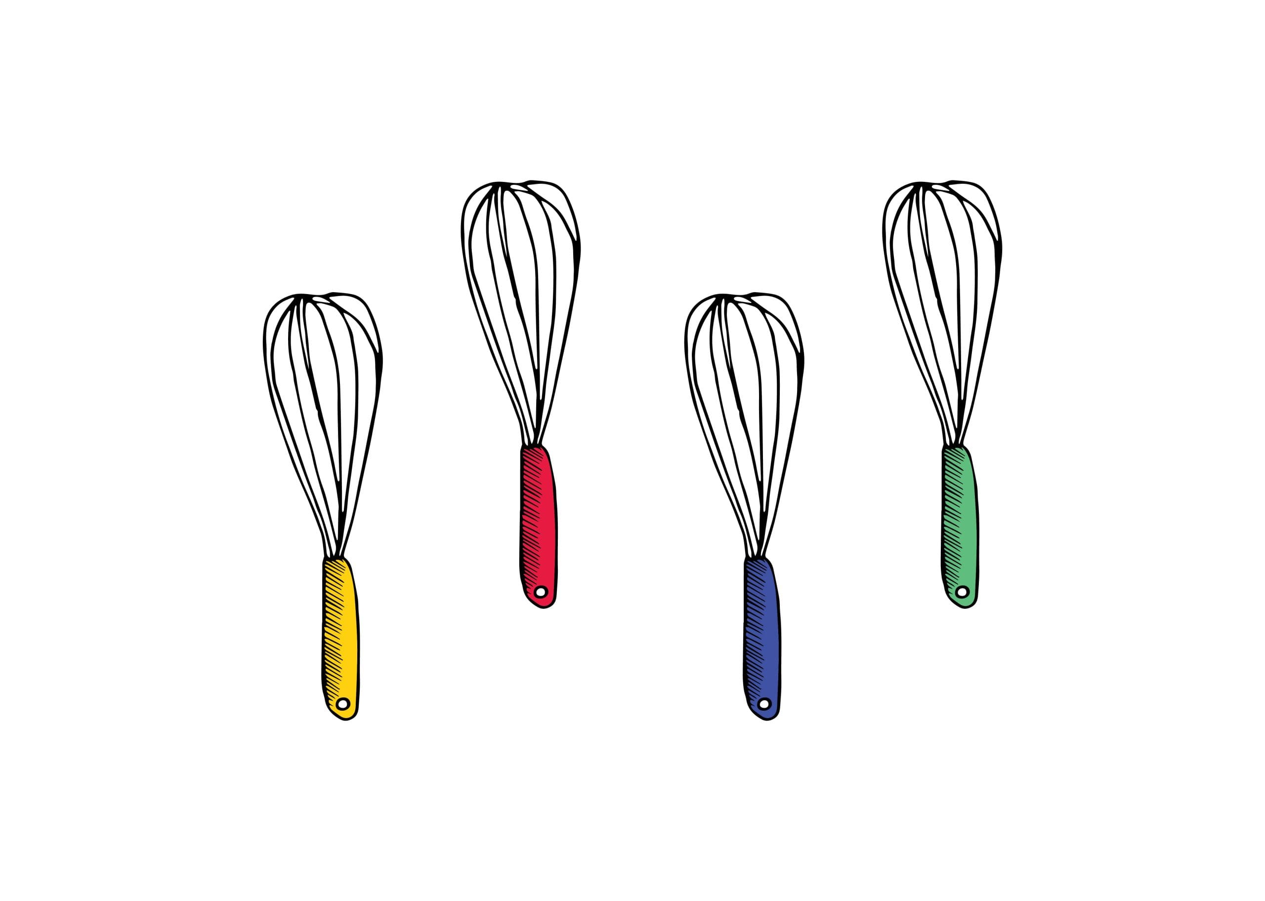
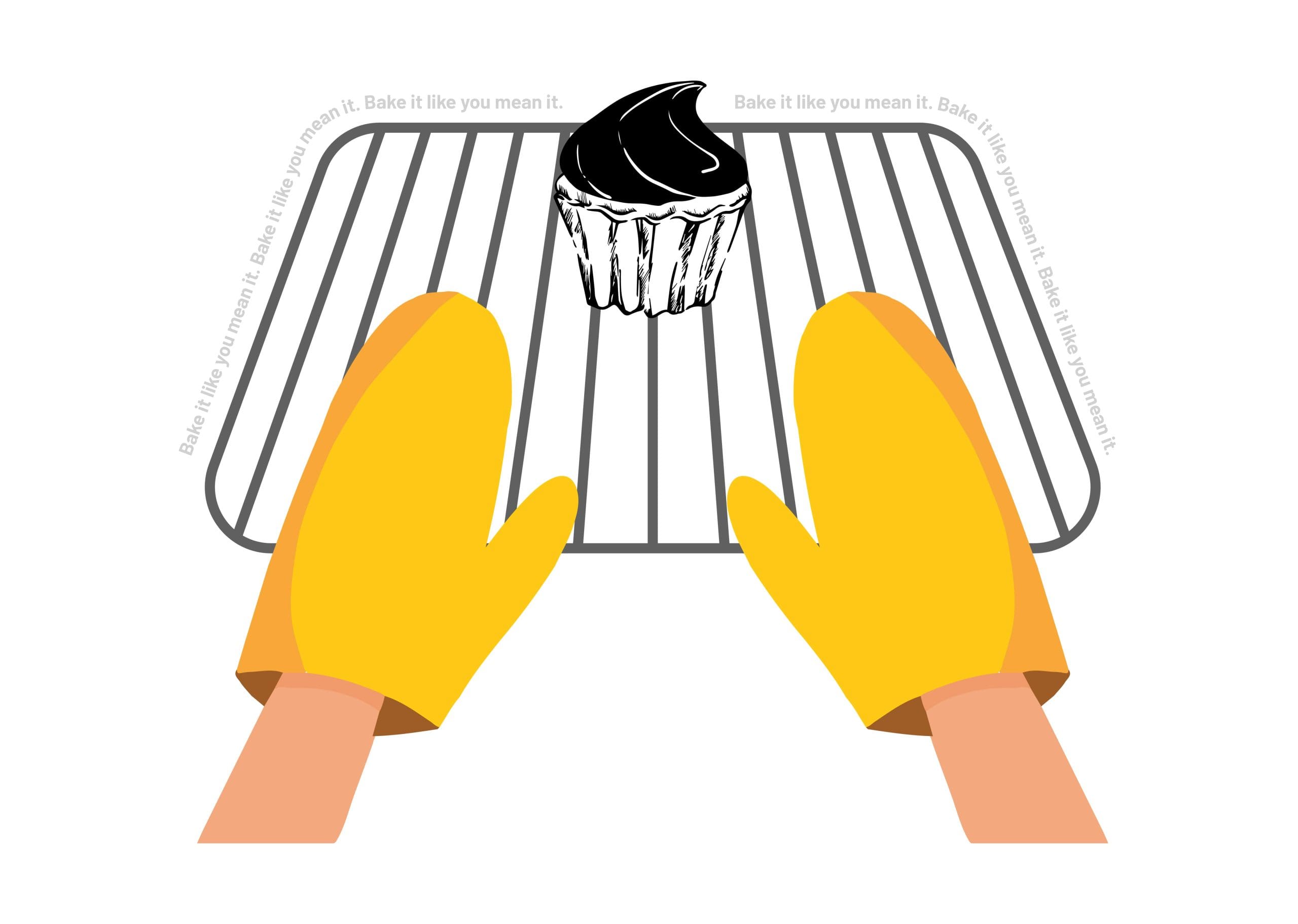
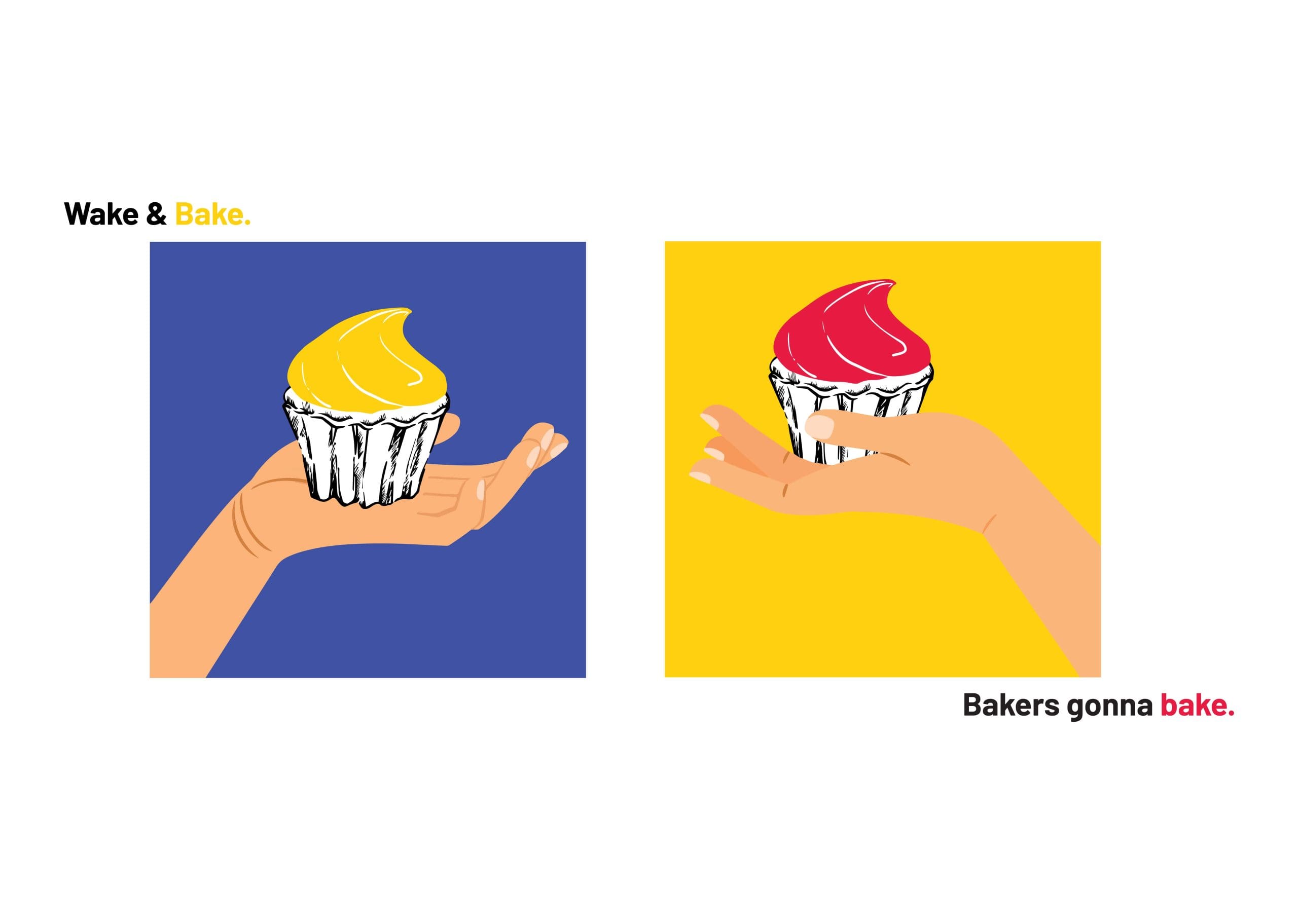


Despite not being tasked to create a complete ‘brand identity’, things somehow seemed to naturally fall into place with progression from the logo to the packaging design. A kitchen complete with a checkered tablecloth, typical home bakers tools, and brand mandates – vector illustrations and pop colours came together to create the personality of this brand. All in all our aim was to establish familiarity.
Logo Design
Packaging Design
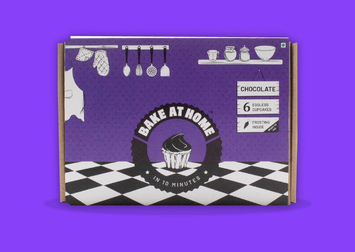
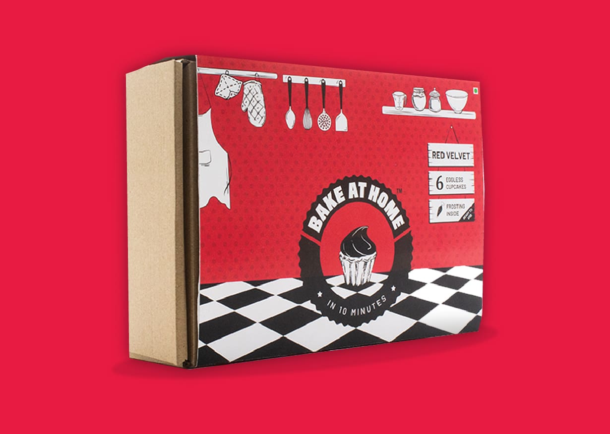
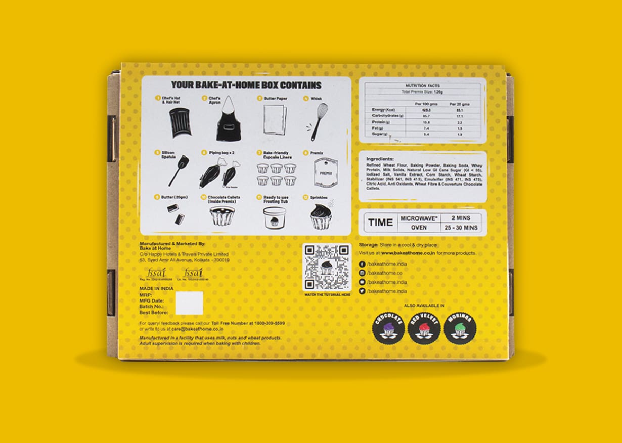
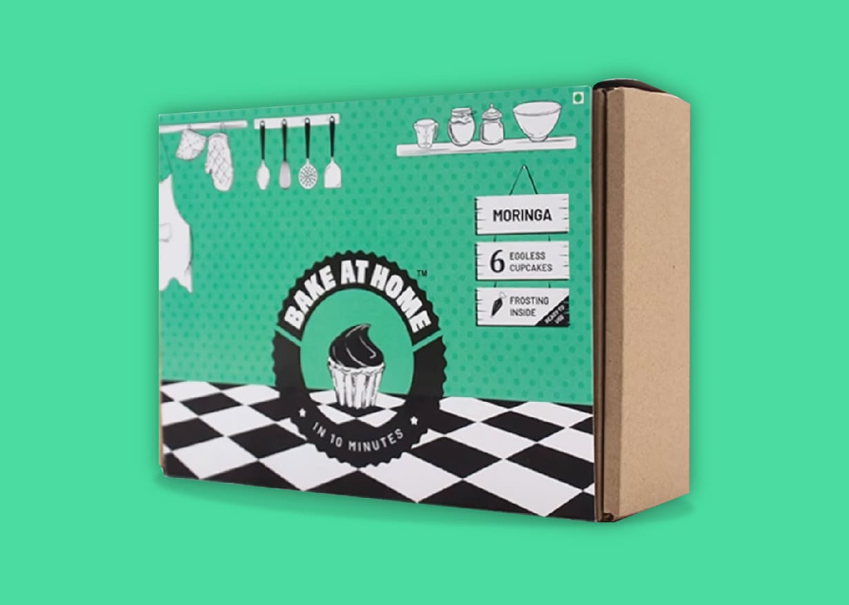
The packaging design became an extension of the brand identity, stemming from the inspiration of vintage American signages. With a warm and homely vibe, the packaging was kept personal and relatable to reassure the customer of the ease with which they could pick up this kit and Bake At Home.
Print Design
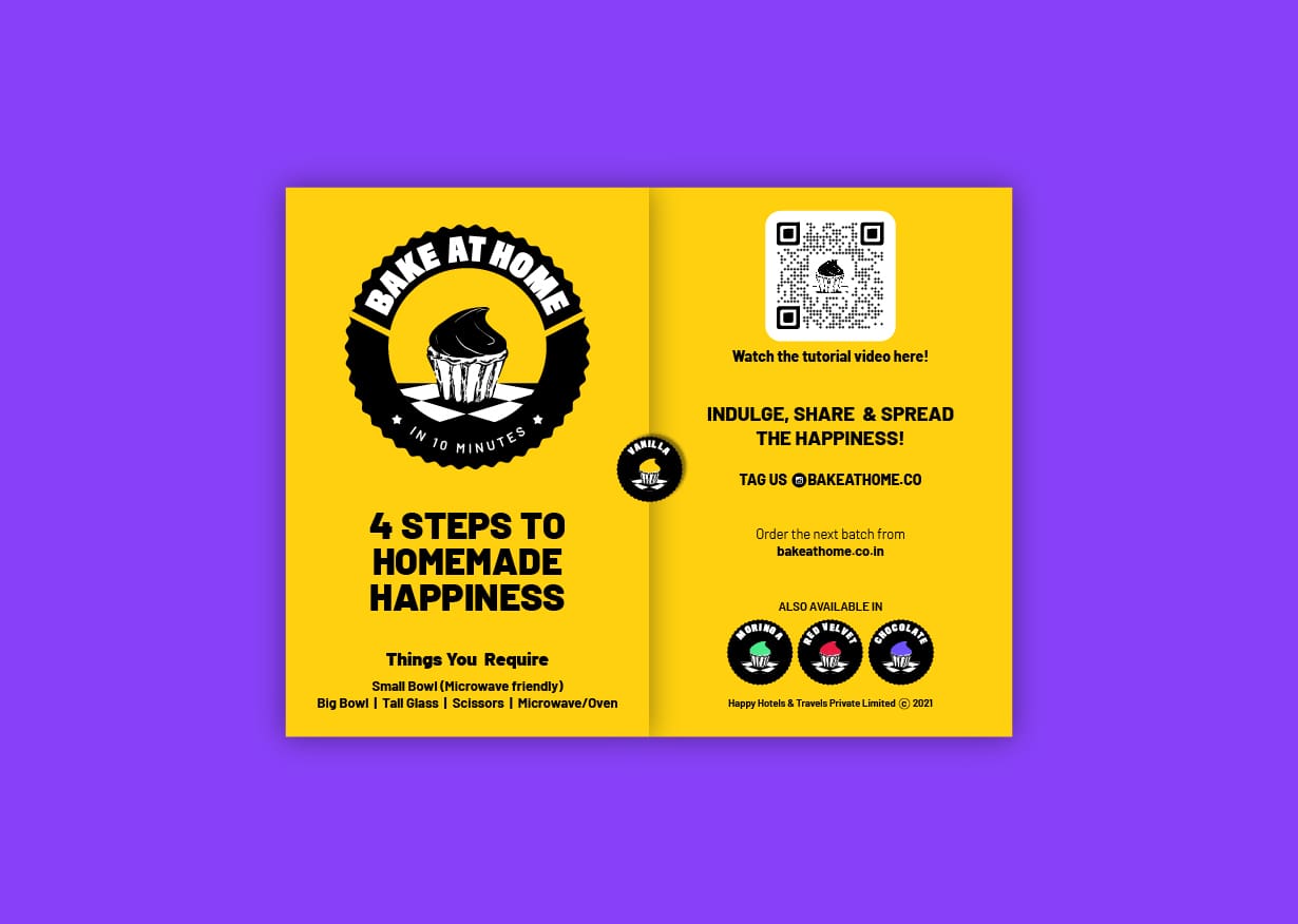
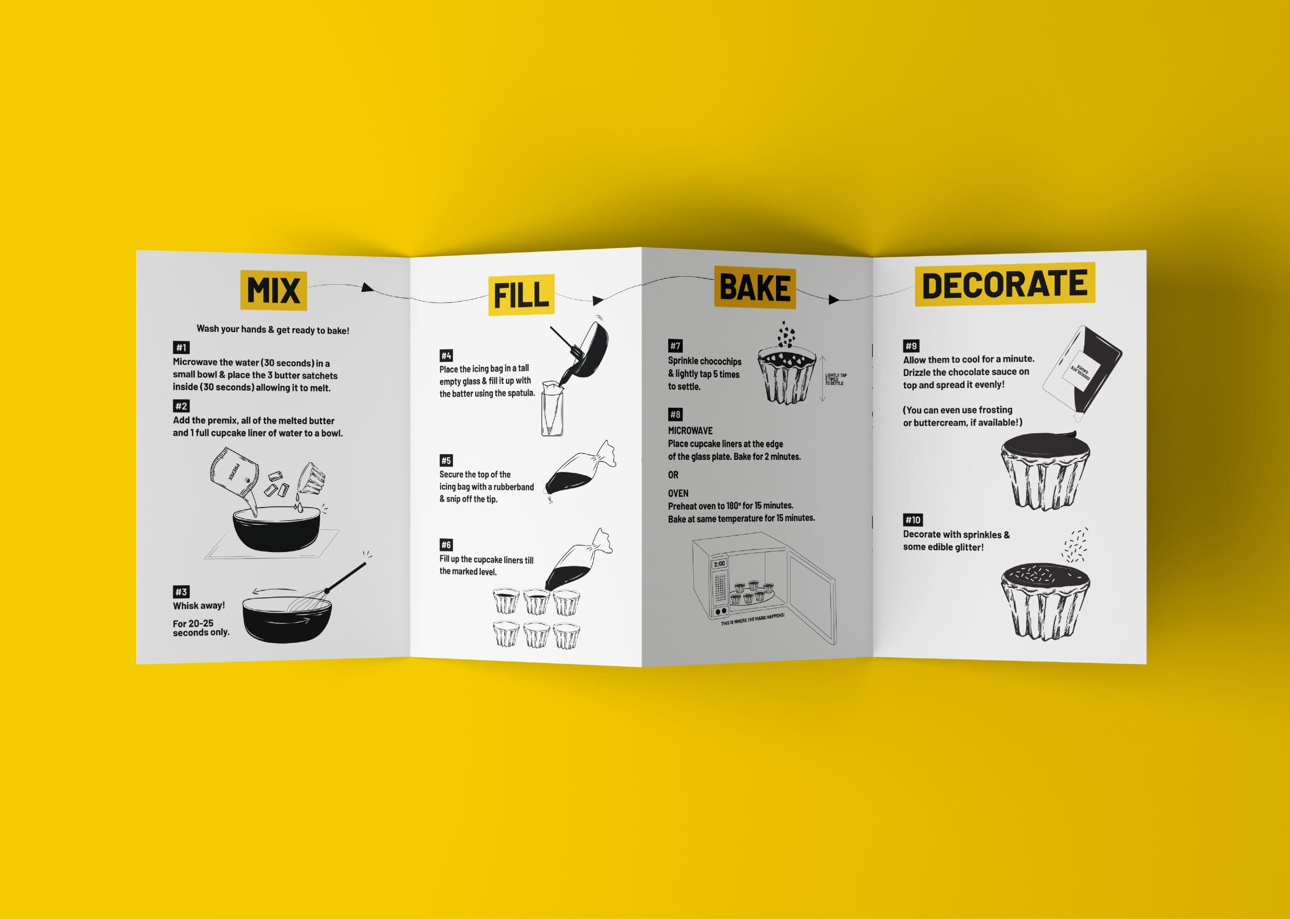
The communication inside the box is as important as the one outside. Clear instructions with illustrations guide their user through the baking experience.


