SCOPE OF PROJECT:
Packaging Design
Design that is a combination of tradition and modernity, we created a pattern that is an extension of the brand’s logo – inspired by designs of the Middle East.
SCOPE OF PROJECT:
Packaging Design - Early Grey Tea
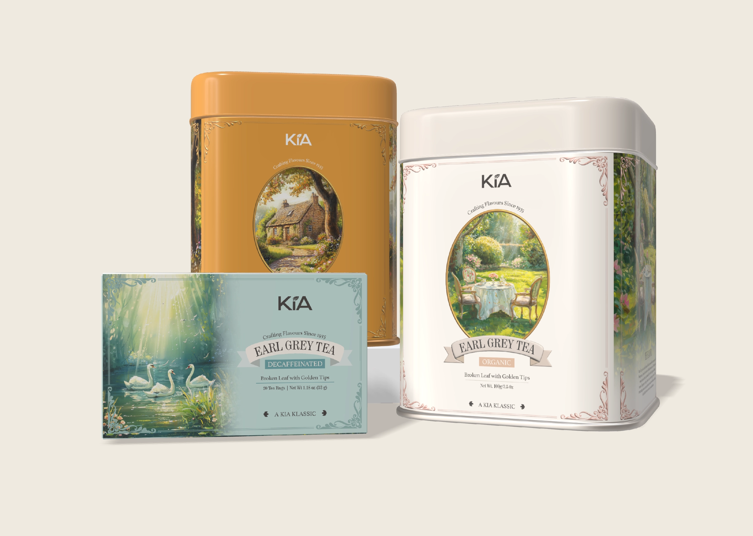
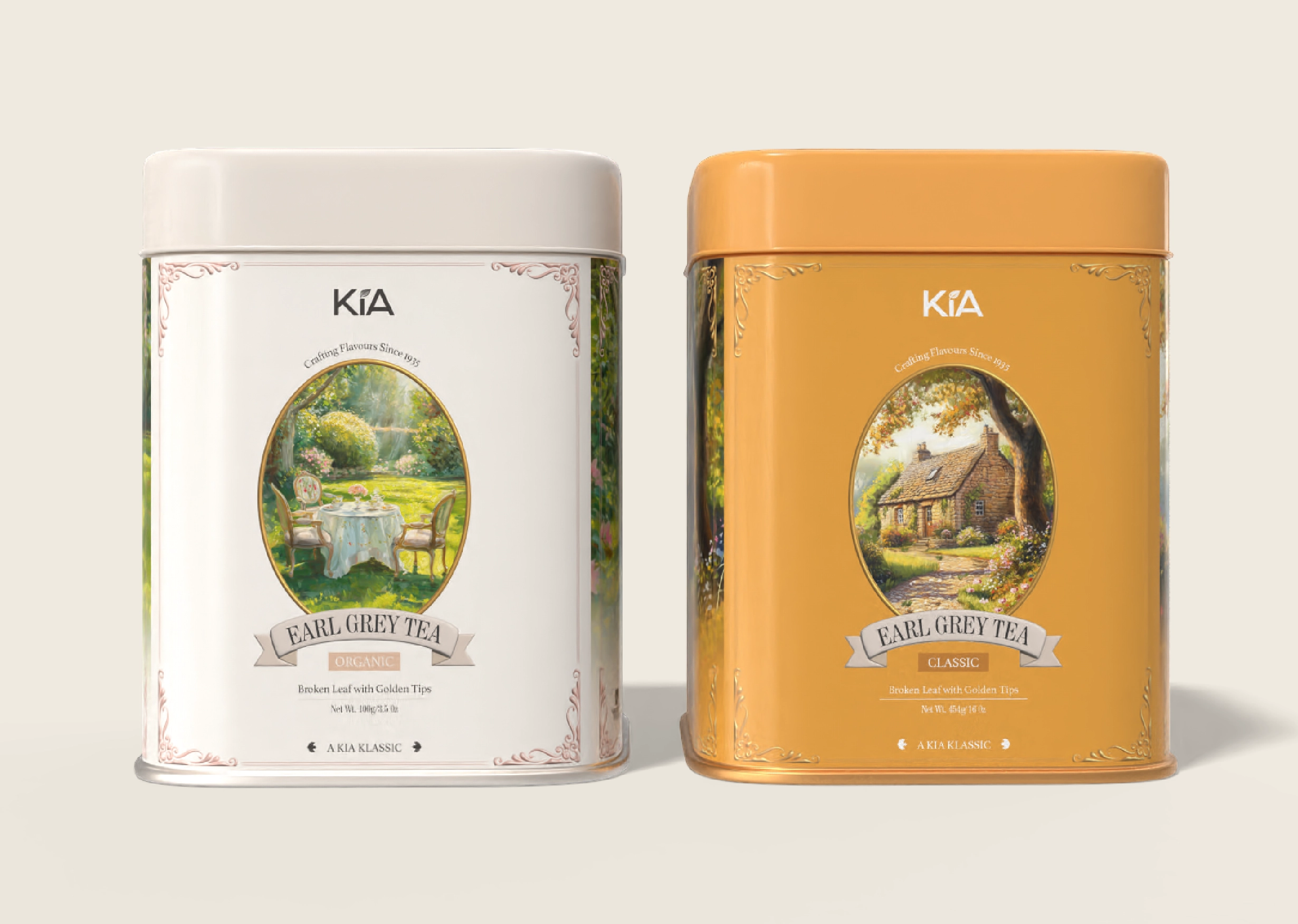
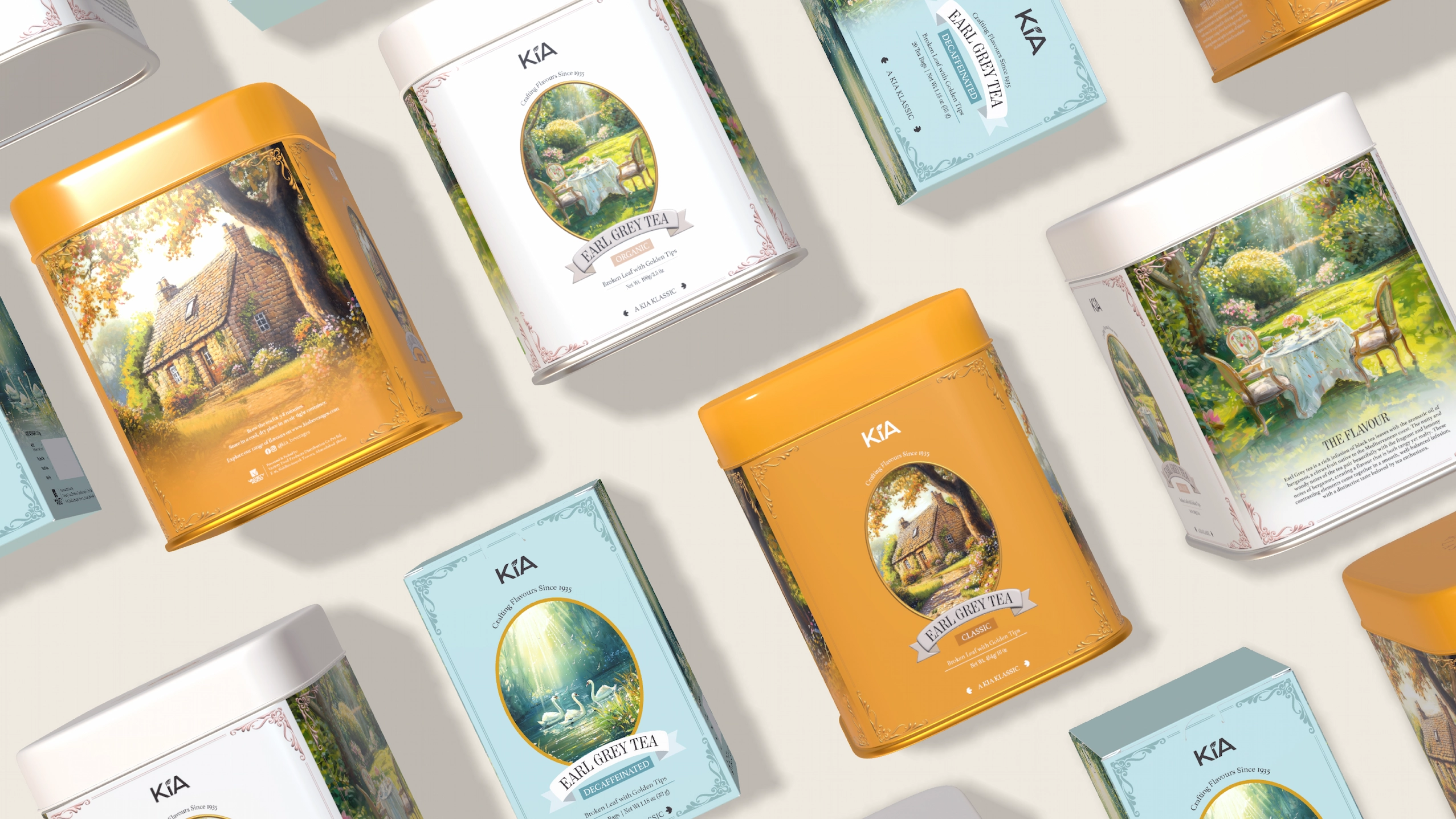
The process of making tea and the drink itself is a sensory ritual for tea connoisseurs. For Kia’s Earl Grey range, the tea experience began from the first point of communication – the visual one sees when choosing their tea. The packaging evokes a sense of richness and warmth, even before the first sip – with snippets of serene English countryside framed by ornate borders. Applying our sensibilities across all three SKUs and seamlessly integrating the required mandates, the result is packaging refined enough to be at the table with your tea.
Packaging Design - Matcha Green Tea
Within Japanese culture, tea-making is a grounding tradition and a practice that instills calm from picking the tea, to preparing and then consuming it. For Kia’s Matcha Green Tea packaging, we designed a cylindrical box with a subtle gradient. Japanese text characters and an illustration of the tea-making tools were used to bring out its traditional aspect. The copy on the packaging weaves in the four principles of the tea ceremony, alongside clear instructions on preparing the matcha.